LO1 - Conceptualize, design, and develop interactive media products
Me and my team have decided to go with a education theme during the FAST FORWARD week. We had to generate a crazy futuristic idea that could be real in 2050. In order to start with our project we have organized a ideation session.
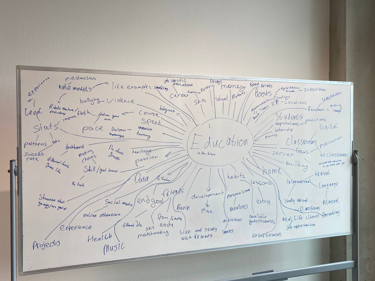
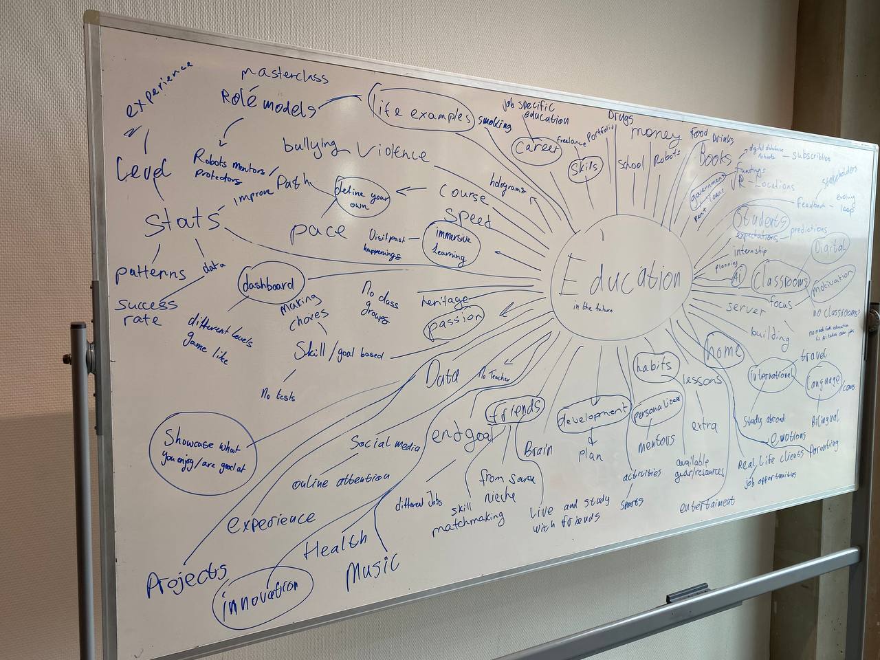
I found a board on which we could brainstorm and write all the words that come to the mind when we see the word Education. I noticed that we were all not really in a flow state when doing this task, so I tried to make others more comfortable by writing lots of different crazy ideas in a row myself. I can confidently say that it worked as others started mirroring my behavior and started producing decent ideas.
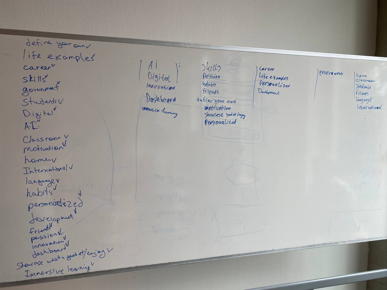
As a result we got a full board of different words and I circled the main topics that we liked and which we may utilize to fit the project in the future. When circling the word we had to explain in a few words why we think the idea is worth exploring so that we all are on the same page. I then wrote down all the circled words on the other side of the board to get a better overview of them and we then combined them into piles of connected topics. This gave us a foundation for the project.
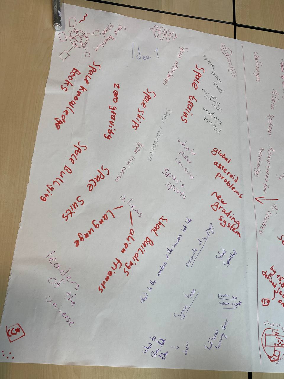
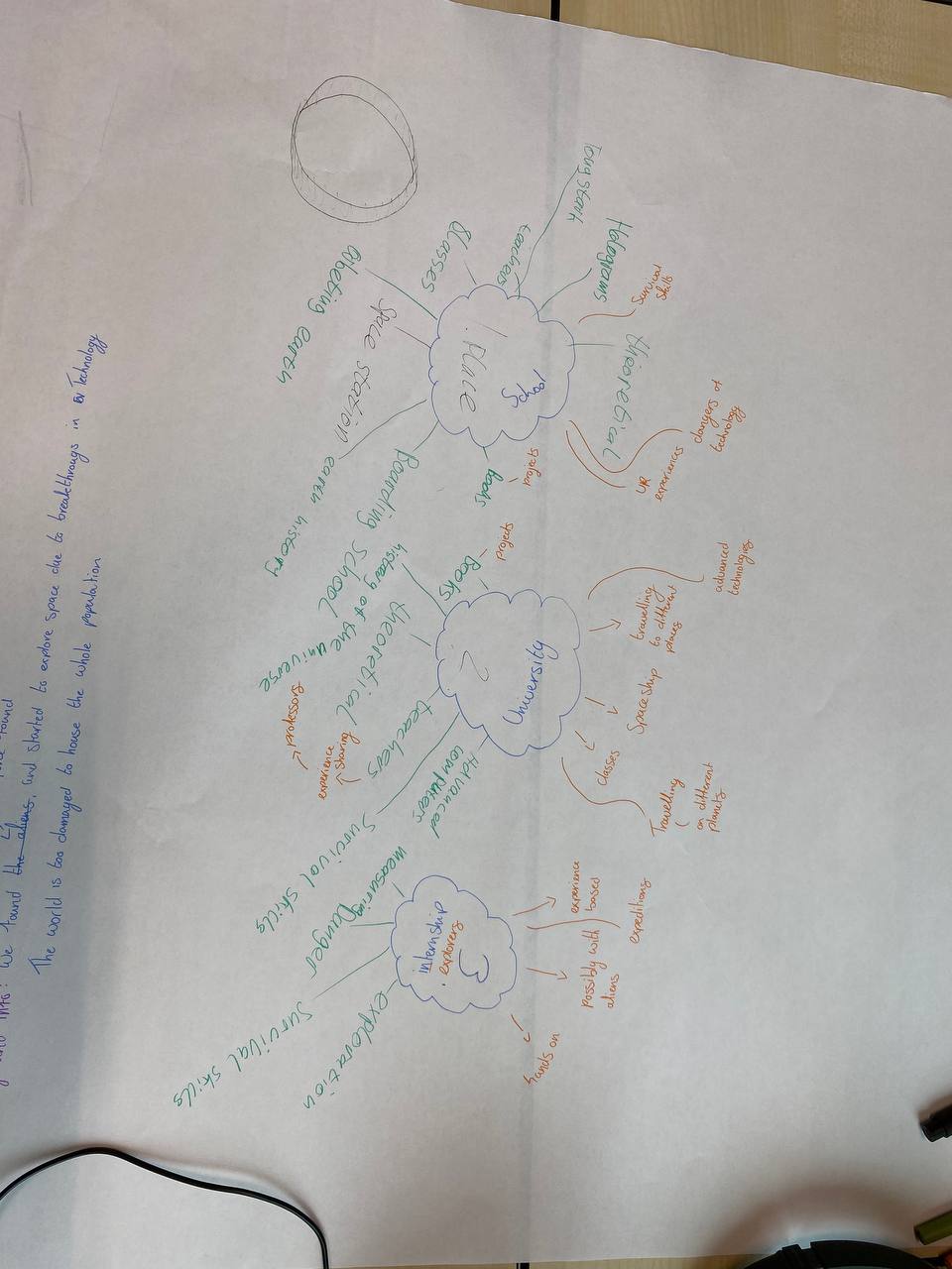
After the brainstorming session we came up with two ideas. One of mine, was a space station that would act like a school/university and the other one was a heavily protected “Doofenshmirtz” type of tower that would be an ai center that would control the world. To choose which topic to go with I brought a big piece of paper on which we could brainstorm more ideas about both things. After seeing the potential of the space station topic, the whole team agreed upon working on that one. The next step was to use the context that we got on the topic and create a deeper story out of it. On a new paper, me and my team wrote down 3 main categories that would exist in the concept: School, University and Internships. I had good ideas that we implemented by the end of the project like doing expeditions with a crew on a spaceship for the internship or making schools orbit the earth so that kids could still come back home once in a while.
Our brainstorming didn’t have a perfect start and we got stuck at some point. I was telling our early ideas to Stan when he came up to our team and he was suggesting to go crazier and more unrealistic, something that would be hard to find on the internet. Stan also told us to get rid of our laptops and do a brainstorming session on a board. This suggestion did in fact help us to stop the brain rot and get better idea faster. Next time I would definitely prohibit using gadgets in the starting point of ideation phase.
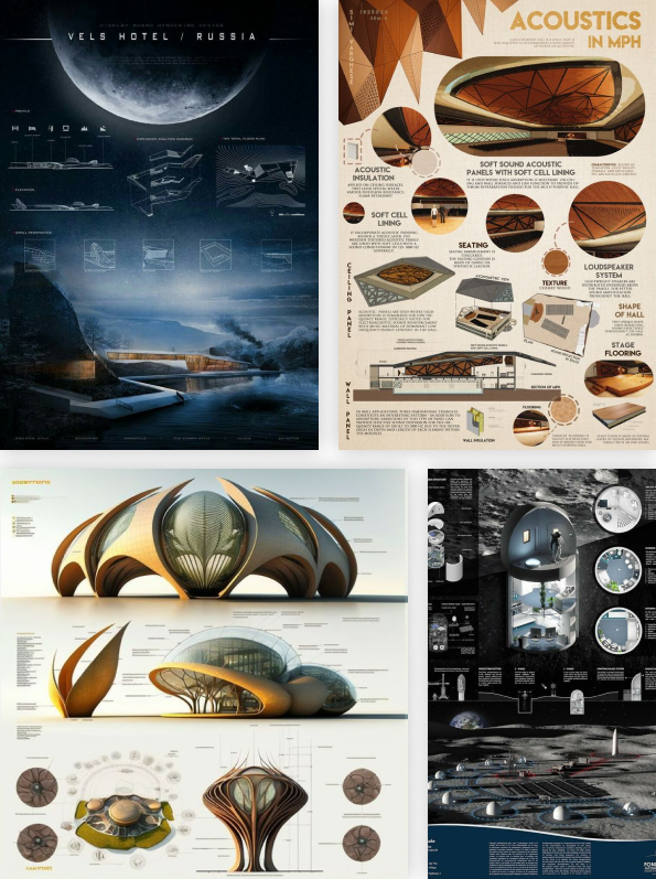
With my team we decided that for a final presentation we would need a poster that would tell the story of our space education concept and show some interesting images. Because we had 3 different people that wanted to design the poster I suggested all three of us to give it a shot. I gave each one of us a topic to create a poster for. My teammates got “School” and “University” and I got “Internship”. The purpose of that practice was to see what ideas and styles we have in mind so that we could pick the best one and create a final poster.
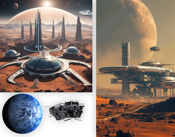
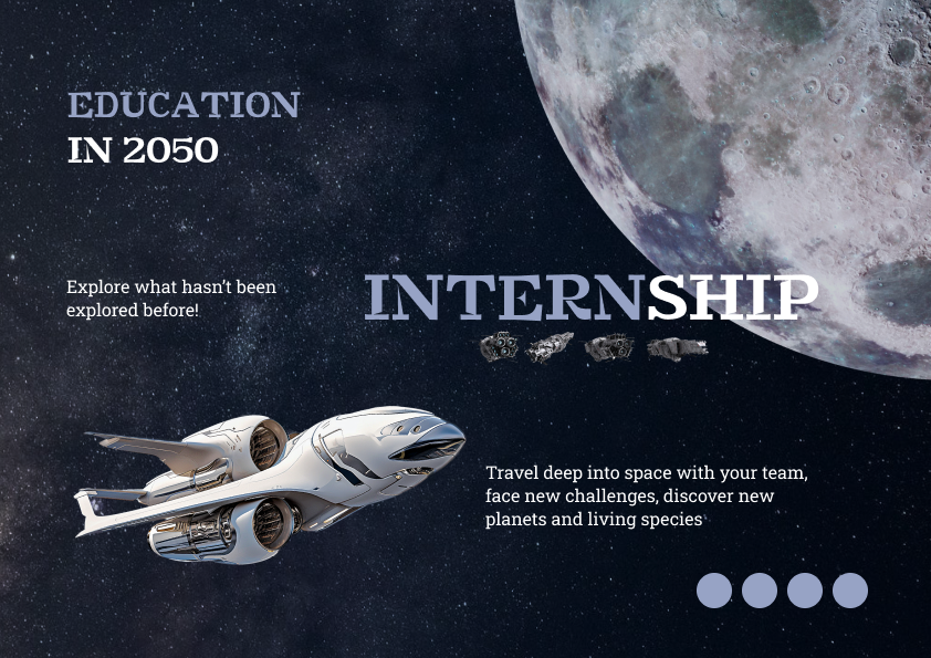
The first step in designing my poster was gathering inspiration. I went to Pinterest and after surfing there I saved a couple of works that I found relevant. I gathered all the photos in Figma and created two mood boards that I could always come back to generate better design solutions. One of them was more of a poster design board that had a futuristic theme and another one was just about space in general. Those products served great help in designing the poster. As an example I have noticed a pattern of cutting of parts of the planet behind the frame to make the fit, but also look massive, This nice element helped me with making internship look like a big deal because of the big look that a planet has. I also noticed how I put the spaceship and the planet on the second moodboard and thought I could use this to show the expedition/exploration of new planets with just those two images.
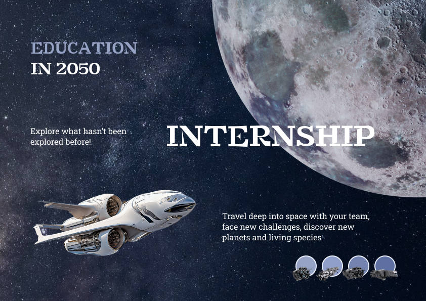
After making moodboards, I created a prototype of a poster with simple shapes to plan out the content placement, before adding text and images. I came up with an idea to show some planet on the top right corner and a spaceship looking towards it, to show what an internship is about. i also left some space for text, and added small circles the could show colors or be placeholders for something else. After completing the prototype I started designing the poster. I found a new futuristic spaceship image, a planet and a nice looking background that I edited a bit to look darker, so that the text is mor readable. I then added text and while putting the word internship over the planet I noticed the word play “Intern—Ship” so I couldn’t let the opportunity to pass and changed the color of “intern” to make it a bit more obvious. During my time here at Fontys I have learned that this is what designing is about. It is just about noticing those small details and then being able to manipulate them to serve a greater purpose.
With the amount of time that I had I think I did a good job. Next time I would want to make more prototype versions to try out more things. At the end of the day the team showed each other the concepts and since everyone like the style of mine it became my job to design the final actual poster.
For a final poster design I had to include the whole story and timeline of our concept on a single page with complementary images to support the text.
I started this task by sketching, I already had a clear vision in my mind so it took me just a couple of iterations to get the result I wanted. In a process I found out where to put the “Education in 2050” text, how and where to include more images within the text and how to make the design more engaging.
The next step was creating a Figma wireframe of the sketch to see how it looks like with real dimensions. I explained my idea and showed the prototype to my teammates to make sure we are on the same page and then started slowly adding in the text and images. I used a blue-greenish color base for the poster and used it for the headings and as a filtered background. I also found a green planet that I put behind an image to add depth and make it bigger. I made sure that all the content is aligned and is pleasing to an eye.
I think the poster turned out great, based on the reaction that people were giving me when they saw a printed version. The design was interesting to look at, colorful and easy to read.
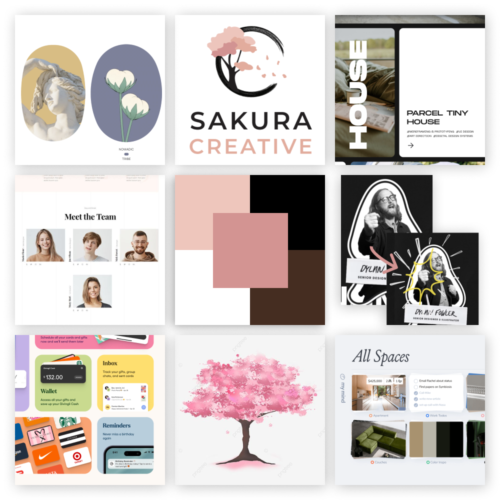
In order to kickoff designing the team website I had to create two mood boards. The reason to do so was to have different templates and design solutions close by, when designing the pages. A pre-gathered inspiration always helps when you get stuck choosing what to do.
To create those I used several tools like Pinterest, Awwwards, Dribble + some websites that I have already known of. For a home page mood board I created a nine tiles template in which I could put in the screenshots of designs I liked. For example, I liked one of the websites idea of implementing team cards. They had similar grey and white pictures of the team so that there is consistency in design, but they still managed to include their own unique characters in the hover animations. When you hovered the person a drawing appeared over them, showing their personality and likings, making it an impressive feature that I wanted to implement in my design. I also remembered to put in the color palette in the center. For the Contact us page I put in the styles and catch phrases I liked and at that moment I decided to make a that page to look like a letter. This would fit the identity of our brand well.
As a result I had two good looking moodboards that I was keeping close by when designing, so they would help me choose what to change and iterate.
Before starting to design my personal portfolio I had to make certain choices about the style, content and structure of the website. For that I have created a document in which I could state all the decisions I have made, to keep track of them. I found a template online and picked out the topics that I wanted to think about. I decided that this time I would be making a dark mode website and that the theme would be mountains. I also decided that I am going to create a desktop website only because mobile website wouldn’t align with my and my teachers’ needs. Obviously I couldn’t fill all the content right away, there were topics like colors, fonts and structure that I was filling in during the design process of the website.
I believe it was a useful practice as for my project right now and for the future, when I would work on bigger projects in teams and we would have to make decisions together and state them officially in a document.
One of the first steps to creating my own portfolio was finding inspiration online. My main tools were Pinterest and Awwwards from which I have gathered interesting ideas.
I went online and started looking for design elements that I find appealing. I created a document in which I have gathered screenshots and described what exactly did I like and how may I utilize these ideas into my designs. This kind of research proved to be effective as with its help I managed to find a header font that suits my theme. I also found professional ways to present and explain design choices through detailed imagery. Another thing that has caught my eye is a similarity in the work of professional designers. Many of them use a laptop mockup on the project pages in which theY put the photo or a video of the website they have made for a company. It is a very immersive and trendy way to present your work, that I would definitely try recreating in my portfolio.
As a result I managed to find enough inspiration to set a vision for the design of the website. I enjoy this practice and find it highly effective, so I will keep on mastering it in the future.
When I completed the full design of the home page of my portfolio website I wanted to see what kind of animations and transitions could it have.
I did it with help of Figma’s components. I duplicated different sections of the home page and set up a chain reaction. I moved out the elements of the frames and in the next I put them back in, then I linked the frames, so that after a certain delay of 600ms it would change to a next frame that already got all the content. I used smart animation with ease out effect to make the transition smooth and yet not take too long. Unfortunately Figma doesn’t support parallax scroll or move sophisticated animations, which is why on some sections the trigger is set to a mouse entering the element, which ruins the composition. Despite it being not perfect it was an interesting experience getting hang of the component possibilities.
I have designed the learning outcomes section to be 5 cards that collapse using flex-grow and I needed to code it in my portfolio
For that I have created 5 card elements in which I placed the needed text, number of the learning outcome and the images. I have decided that there would be one card open(active) at a time, so when you hover to open another one, the rest collapse. Those cards that are collapsed would always display the number of the learning outcome “Lo1-5” to make sure that the user is always aware of the content that the cards contain. I set up the JavaScript file to read when the mouse enters a card and then to give it a new class of the open card, that has a property of flex-grow.
It took me some time to get it work right. I found some other versions of the collapsing cards online but they worked onclick and a bit differently, so with some Youtube surfing and help from Chat-gpt, I managed to animate the learning outcomes cards.
In order to develop an app for CBR that would help students to learn at their own pace, get access to quizzes and tests and track their progress I needed to find inspiration of different elements from similar websites/apps.
I have had an app called Imprint for a long time on my phone and it was an app for self learning about different topics like psychology, sales, happiness, health and so on. It has caught my attention with its short articles on those interesting topics. There was a 4 minute reading content that you had to scroll through and it had interesting imagery and a built-in quiz to keep you engaged. I liked the way the app is made a lot and I drew lots of inspiration from there and some other apps, sites I know. I created a PDF document that contained all the interesting elements that my team could look at to generate better ideas and solutions.
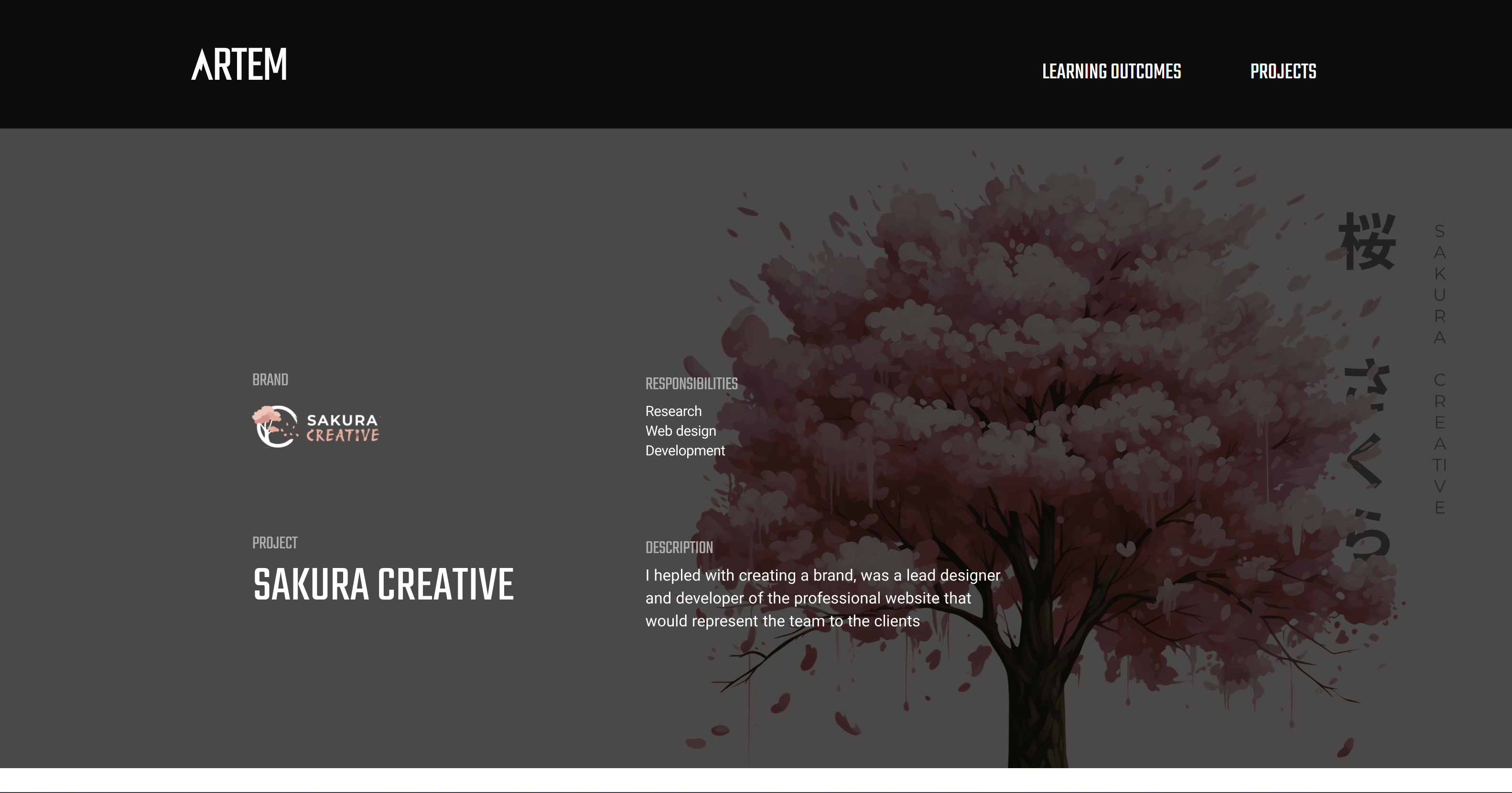
I wanted to showcase the first project description page on the second portfolio review. I managed to finish the design of the page in Figma but didn’t have time to code it. So I put the whole design as an SVG image, so teachers could already see the projects content. It may take around 10 seconds to load because of the SVG size. Later on I will code the pages to be semantic elements.
I divided this project on 4 phases: Research, Design, Execution, Reflection and to each topic I added a story quote to make the articles immersive. I then decided what kind of content will there be per phase and started designing. On the cover page I added the brand logo, a project name, my responsibilities and a description. I then stated the “challenge” or the “goal” of the project. In this project storyline I mention the products that Sakura Creative has made but then talk and show only those things in which I played a part in. Nearly by the end I link the final website and propose users to see the final result. By the end of the project briefing I have a “Measuring success” section, In which I talk about my experience with the project, what went well and what would I do differently next time.
I think the project description turned out amazing, it is simple, doesn’t have too much text, shows a lot of visuals and just guides the user through the story. It keeps you hooked on the plot and makes users want to know more about what you did. I will keep a similar format of stating a challenge, having phases, showing final product and measuring success in the other project pages I will make in the future.
I got a lesson from Stan about three.js during which we were putting a 3D model on the screen and animating it. This was my first experience with three.js so it was interesting to see what its capabilities are.
We got initial code from Stan and with his help set up the scene canvas, the camera position and the light source. Then we went to Sketchlab to grab a 3D model we like and then embed it into the environment. I decided to put in the golden snitch from Harry Potter movies, so that I could make it fly across the screen. We then got full freedom to experiment with movement, scaling, positioning to make the 3D model engaging. I developed an animation loop with flying and rotating effects so that the model moves around the screen while changing its rotational values. I additionally made it possible to control snitch position by had, so the user can add extra movement by grabbing the screen and moving the element even more.
As a result I got this cool 3D effect of the golden snitch trying to fly away and avoid getting caught. It was an interesting experience and I can already think of ways to gamify stuff using three.js.
When creating a Portfolio project documentation page I encountered a challenge of fitting in all the iterations of the hero page design. I didn’t want to put the frames one by one under or next to each other, because the page was already quite crowded with images, so I needed to come up with a way to fit in the hero page frames.
I found a game company that had lots of cover images for different games, they created a carousel slider out of them and it looked amazing. I implemented this design in my work by finding a swiper cdn online. I set up the containers, put the images, added desirable styling and tweaked the JavaScript to make the card transition smoother.
As a result I got this cool 3D effect of the golden snitch trying to fly away and avoid getting caught. It was an interesting experience and I can already think of ways to gamify stuff using three.js.
When creating a driving study app, I needed to do some research on the types of the lessons that could be in the app. It was important to develop a concept that the team could use for example lessons and for the client to understand the idea better and have guidelines to create lessons themselves.
I created a Word document in which I included all of my findings like methods, lessons structure, references and so on. I documented the file up to professional standards, including the dates, my name and starting writing the new topic headers from a new page. I drew inspiration from Duolingo and Imprint as the lesson providing apps. Appealable scrollable lessons with little text and useful imagery would be a good solution to our target users, who struggle to focus on tasks and lessons for a long time.
The document provides detailed information about how to divide driving topics, about how to structure the lessons, their overviews and what type of questions/quizzes should be at the end of each lesson
I created a wireframe for the app that our team develops and in order to validate it I proposed the team to test its usability.
For that me and one of my teammates have created two documents. The first one was a script document in which I wrote down an introduction of the tasks the user will undergo in the session and the purpose of the app, to give some early insights. The second one-page document included the test goals and different tasks along with a success metric to measure if the test was successful.
As the result, both documents served well in the testing process and helped with consistency across results.
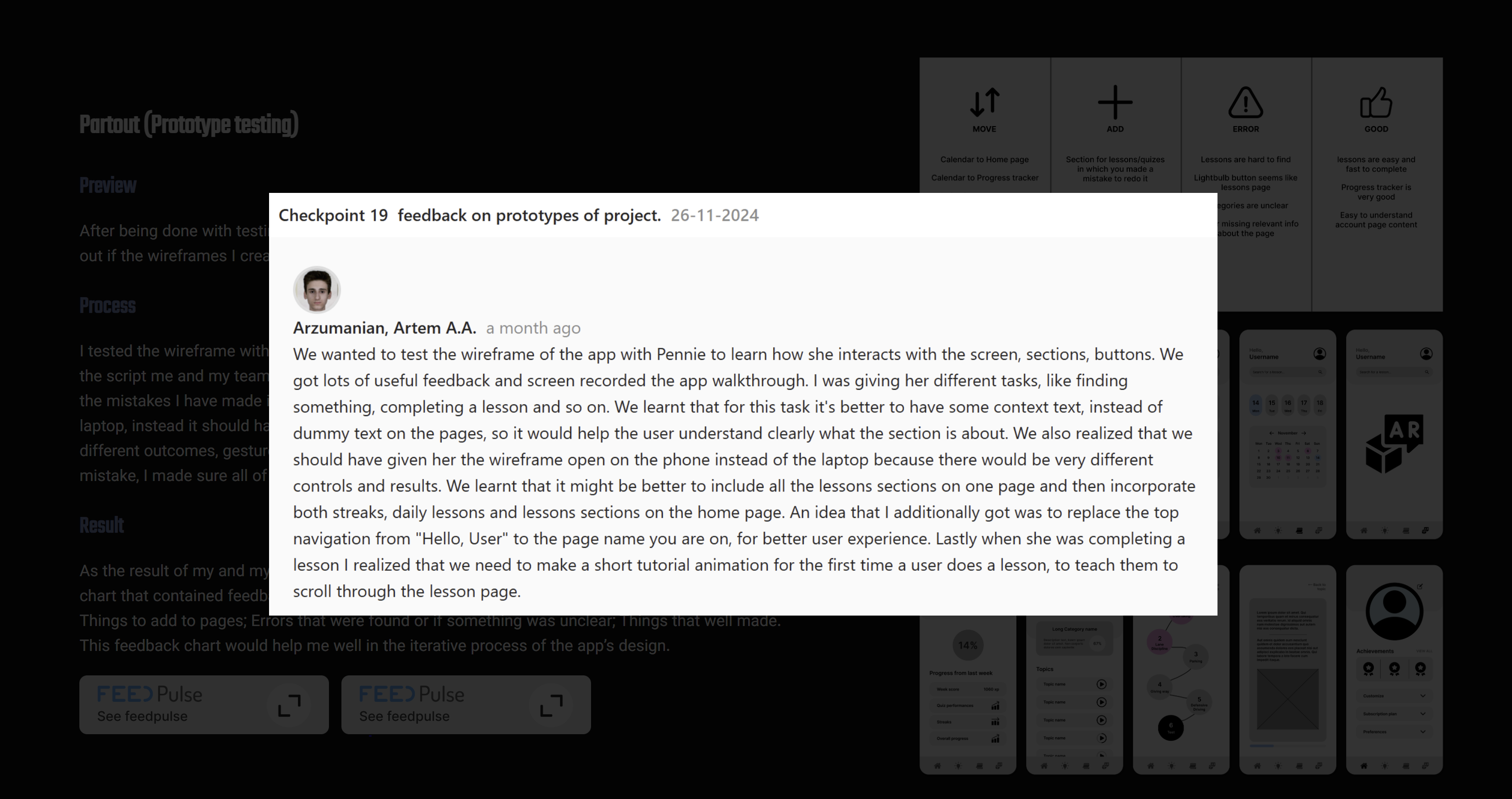
After being done with testing documents we went on to conduct tests with different people to fins out if the wireframes I created were intuitively easy to navigate through.
I tested the wireframe with two people and while doing so I was giving them out different tasks from the script me and my teammate made to see if the user can complete it. After the first test I realized the mistakes I have made in the testing process. I was giving the app prototype to the users on the laptop, instead it should have been on the phone as the app is for phones only. There would likely be different outcomes, gestures and logic if the test was initially done from the phone. Recognizing the mistake, I made sure all of us conduct our further on tests with phones only.
As the result of my and my teammates’ tests I have combined all of our notes to create a simple chart that contained feedback: On the sections/elements that should be moved somewhere else; Things to add to pages; Errors that were found or if something was unclear; Things that well made. This feedback chart would help me well in the iterative process of the app’s design.

Midway through the research phase of the Partout project I took on a task of creating target personas. My team has already done enough research to iterate the initial personas the client gave us. I wanted to change them a bit based on our own findings so we can showcase that to the client later on. I learnt that the main struggles of anxiety and not being prepared for the driving tests lie further in peoples core needs and problems. Some people can’t adequately fit in their driving studies in their weekly schedule which resulted in low exam results. Others struggle with anxiety because feel like they aren’t good enough, even if they are, which also leads to poor results. I wanted to include those more meaningful findings in the new target personas I created.
As a result the target users now possessed way more then just age attributes, but also their struggles and needs, that our team could try to satisfy with our product.

The last part of the designing phase of the Partout project was making the prototype interactive. Using Figma’s prototyping tools I have connected all the needed sections and buttons to their respective pages. I also implemented a feature I didn’t know about before which is the scroll behavior. I created frames that contained the content that needed to be scrollable on the page and then tagged the horizontal and vertical attributes to them to make it possible to scroll them. I animated the transitions between the pages switching to be smooth and to slide in from the side.
As a result I have finalized the prototypes interactions making it easy to understand which page leads to which and what sections are supposed to show.
I have created a reading guide that will give a short introduction into who am I what are my goals and give a short description into the projects I have been a part of. I have made a table of content for easy navigation across the pages and have written the text in short articles. The client project I have been a part of was for a company called Partout and I have linked the project walkthrough with the tasks I have done in the document. I summed up my progress and experience this semester and placed a burden of proof at the end of the document. It states my personal evaluation of the proficiency per learning outcome. I have linked the outcomes web pages, so you can check the learning outcomes articles from the document as well.
I got suggested to somehow implement the Feedpulses in the learning outcomes I wrote because one of the biggest struggles for all teachers is to find and link the work a student has done with a Feedpulse point.
To fix that issue I have implemented a system I came up with of linking the checkpoint images to the articles. I have created a button for Feedpulses and put them under the text of the outcome. When you click on them an image appears full size, opening a Feedpulse I wrote regarding the topic. This way I make sure that the window is not cluttered with images and there is no repetition of content and if teachers want to they can always click on the feedpulse button to see the needed proof. It also benefited me in the future as I sometimes needed to link more than one checkpoints to my outcomes, which is achieved by just stacking more buttons.
During the passion project I was aiming to not only create the tool I was making, but also go through a proper project cycle. That meant that I also needed research to back up my ideas. Even if its short, it can still prove to be a useful insight into my project.
The goal of the research was to find more information about the challenges lower-semester ICT Media Design students face when writing and coding Learning Outcomes. Luckily for me I didn’t have to interview anyone or conduct surveys, as I have been consciously gathering all that information during my study here at Fontys. I have been talking with my friends, hearing from other students about the struggles students have with this topic. It allowed me to easily identify the main problems that were among us. The problems are: Lack of clarity. Many students struggle with understanding what to write and how to write and different opinions from teachers sometimes makes it harder to decide; Technical aspect. Some people just struggle with coding, but they want to make a portfolio because it gets you better grades; Time management. People find difficult to sit down and do the boring work, or perhaps they have no time at all to do that because of their work. I have heard many different opinions and gathered the insights into a document that could help me in the process of creating my product.
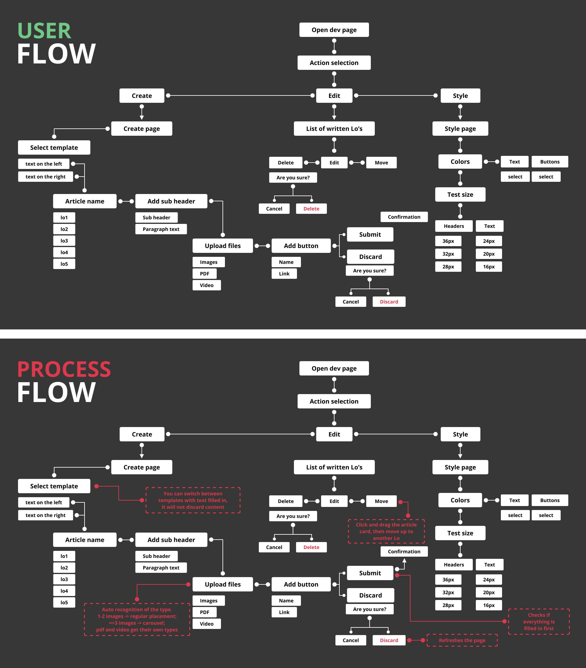
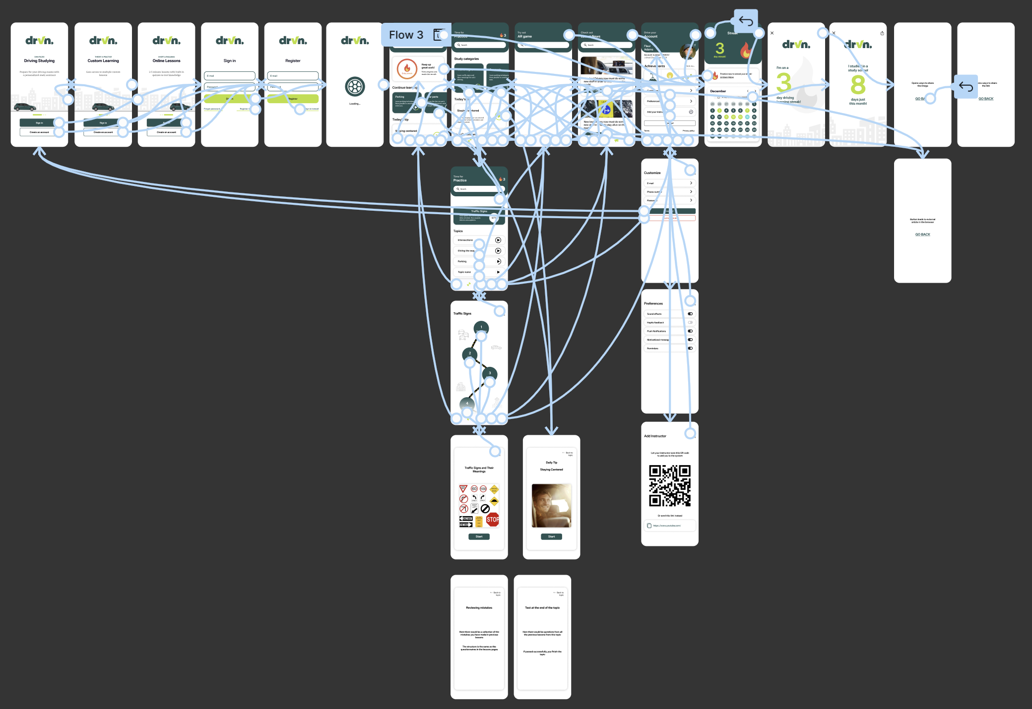
I felt the need of having a final picture of the features, processes, flow and walkthrough of the tool I was creating. To cover that need I have created two sitemaps.
The first sitemap was created to demonstrate the user flow of the tool. With it you could understand that the first step is opening the dev page. Users then would have an option to go to another pages which is defined by the arrows. The lines connecting the parts could also have round shapes at both ends, meaning that the features are within each other, connected, rather than separate pages. I then have created a process flow map that included the backend system information of what is going to happen if a user does some action. I find it very easy to understand and define the tool with the map that I created. The tool helped with remembering such small details like asking if the user is sure he wants to delete something.