Project Cover

BRAND

PROJECT

SAKURA CREATIVE

RESPONSIBILITIES

Research
Web Design
Development

DESCRIPTION

I helped create a brand, was a lead designer and developer of the professional website that would represent the team to the clients.

THE CHALLENGE

Our team got a task to create a Studio S3 brand that we would be able to pitch to potential clients in a few weeks. The challenge was to create an identity for ourselves, think of a studio name, a logo, other brand and communication means. How do we create a brand? What can we deliver at the end of the project? How to advertise ourselves to the clients?

Sakura Picture
Sakura Team

TELLING THE STORY

Since none of us knew what clients could we have and in what media field there are, 
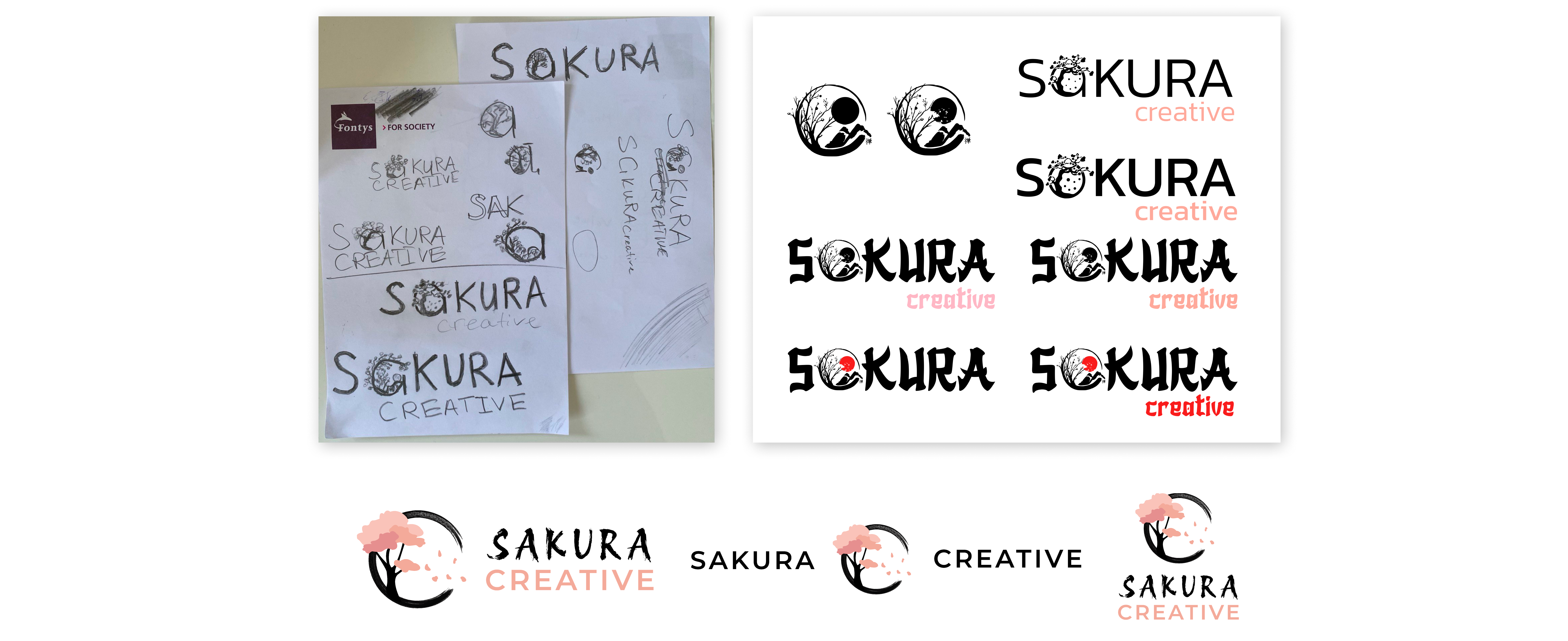
the safe option for us was to go with a modern trend of minimalism. After brainstorming together we came up with the name “Sakura Creative” that would represent our studio brand.

Me and my team have done some research on keywords like: “Sakura”, “Cherry Blossom”, “Japanese styles”, to learn more about their origin meanings. I found out that the Cherry 
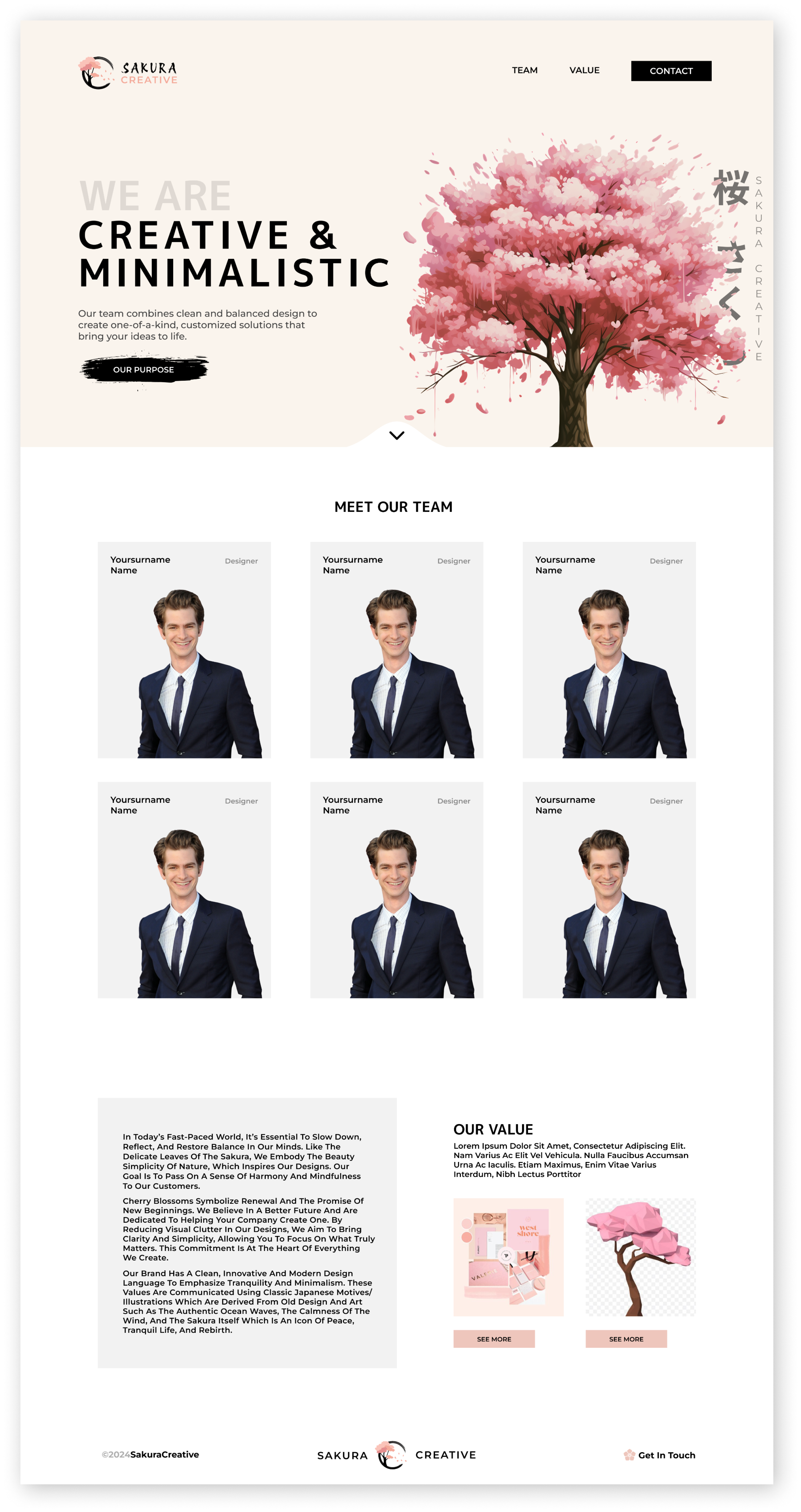
blossoms are seen as a symbol of renewal, representing the promise of new beginnings. It embodies life and balance. That’s what we want to represent. Sakura Creative is about clean minimalistic designs that bring clarity and simplicity, allowing you to focus on what truly matters.

Sakura Tree
RESEARCH

SETTING DELIVERABLES

The next phase was setting up the deliverables that we would execute by the end of the project. Besides the expected products like a logo, a brandbook, a 3D model and a motivational letter I suggested the team to create a motivational website, that would be the face of the Sakura Creative studio.

Sakura Team

FINDING A STYLE

I have created a color palette based on the research my teammate has done and it included the peach-pink color that would act as a base color of the website. Since I proposed the idea of creating a website, I took the role of being a head designer of it, so in order to do that I created a moodboard with some design ideas, that would help with clearing out the final vision.

Sakura Team

SKETCHING AND EXPLORING

The team wanted to look into the logo creating together before focusing on other tasks, so I had a chance to contribute my ideas into the final design. I got inspired online by the Japanese art, the Sun and a tree within it, so I tried implementing it into the name itself. The sketch turned out pretty good, so I transferred it to Figma to create higher fidelity versions of it. Thanks to these ideas, my teammate was able to produce an exceptional final logoby drawing inspiration from the circular shape and the tree it contains.

Sakura Team
WEBSITE DESIGN

DESIGN PROCESS

To start designing the team website I had to ask myself two important questions: “What is the website for?” and “What will it contain?”.

The website would help with:
- Showing our brand (logos, colors, name)
- Building trust by showing our faces and names
- Linking the 3D model of a Sakura tree
- Linking our brandbook
- Showing our design/development skills

I have organized these features of the webpage into 3 sections: Hero, Team, Value and started sketching out my initial thoughts.

Sakura Team
WEBSITE DESIGN

DESIGN ITERATIONS

I had some guidelines that the website should follow at this point:

- Easy to navigate through
- Clean and simple
- Less vibrant colors
- White space around

I transferred my ideas to Figma by creating wireframes. This was an important step as during that phase I presented my work to the rest of the team. They all thought highly of my concepts and gave additional feedback.

Sakura Team

BUILDING THE BRIDGE BETWEEN VISION AND REALITY

The next phase was filling in the websites content and visuals. I have tried many variations of different elements. I have iterated the hero section the most during the creation of draft designs. I have tested different side/center based layout versions of it to see if something stands out as special.

Sakura Team

CHANGING AND REFINING

After loads of iterations and help from my teammates I managed to come up with a good looking almost finalized version of the website. Me and the team got feedback from teachers and have learnt that we are trying to focus on the tree to much, which shortens the scope of the design possibilities, so we decided to find a more minimalistic but still fitting imagery on the side. One of my teammates managed to find a banner with Sakura leaves in it and after I manually enhanced its quality, we placed it on the side, completing the clean look.

Sakura Tree

FINAL DESIGN

I moved the navigation bar to the left to compensate for the space the banner has, made a custom brush stroke button that fits the Japanese style and have created teams cards that contain our full names and roles in the team.

Sakura Tree

BRINGING DESIGN TO LIFE

The project duration was very limited so I had to start coding the website fast in order to make it on time. I have developed the hero and team sections, imported all the needed fonts, set up the team cards animations, so that when you hover you can see our unique graphical designs. That was an idea of mine to show our individuality within the team. In order for the website to be professional I have made the layout responsive, using scaling, media queries and calculation functions. My teammate helped me out by coding the last “value” section to finish the website in time.

SHOW, DON'T TELL

The last task was to create two separate motivational letters to promote our team, one for Rosh, another for Partout. I took an important part in documenting both letters. The most important task was to make the CV short, clear and convincing. There was no need for extra poems to make clients want you on the project. All we had to do is explain who we are, what do we stand for, explain that we understand companies needs/problem and link to our work that will do the rest of the job.

Sakura Team

MEASURING SUCCESS

"Developing a product from scratch is not a straightforward task. Working on Sakura Creative impacted my understanding of collaboration. Not only did I have complete trust in the team, but I also felt a substantial amount of responsibility because I knew we all depended on each other to deliver the finest product possible in such a short period of time."

What went well

I believe we did a great job planning out the project. We divided the tasks based on our strengths and were able to deliver high quality products. Every week we did stand ups, where we discussed our current situations, shared with thoughts and got a chance to be heard. Despite having separate tasks, we all communicated well, on what is done and asked for feedback and help. This is why the website, brandbook, logo and the 3D model all turned out great, because even if you weren’t a man on the task, you still had a stake in the process. I am happy with my progress as I managed to create and develop a good looking CV website that my team and I could be proud of. Credits to my team for the good work they have done.

What would I do differently

The thing that we all failed at was the final deliverable sending. We all have seen the announcement in Canvas from the course coordinator, that said that by noon we should deliver all our products. For some reason some of us thought that we should send it by afternoon and others thought that the timing was not strict, which meant some time in the afternoon we should submit our choices. It was a rookie mistake that none of us double checked the deadline or even asked teachers in person for a clear time. Luckily we started submitting our choice in the morning and finished it in the afternoon without closing the app, which saved us. But the mistake could have costed us to fail despite having amazing work done. It was an easy problem to avoid, which might have costed us to not get our first option client.

SEE NEXT PROJECT