LO2 - Transferable production
While creating a website for our team I benefited heavily from the GitLab functionalities. I created a secondary branch called “testing” in which we could push the code freely and then after double checking we could merge it with the main one. I have practiced using many different git commands to push, pull, switch branches as well as pulling content from one to another and merging. I noticed how it became more effortless to remember those commands and navigate my way through the problems that might occur.
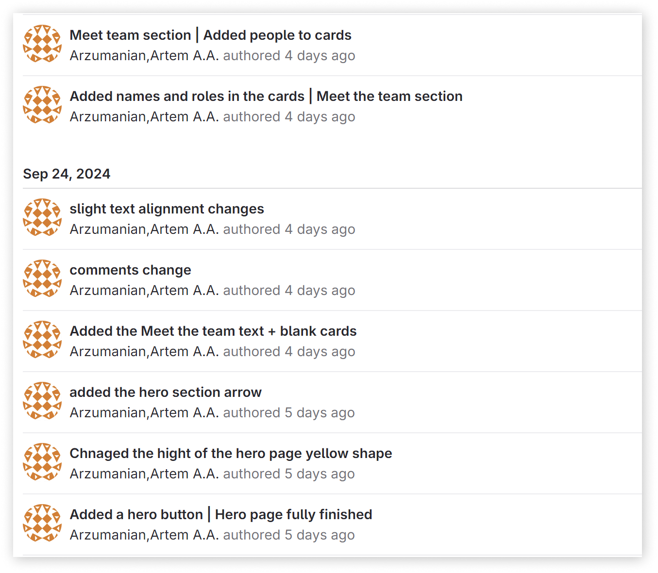
I also developed my own way of writing commit massages. I find it the best, to first write the page or section that you made a change on and then say the exact task you performed. For example: “Meet the team section | Added images to cards”. This way I make it easy for other developers of my team to understand what changed.
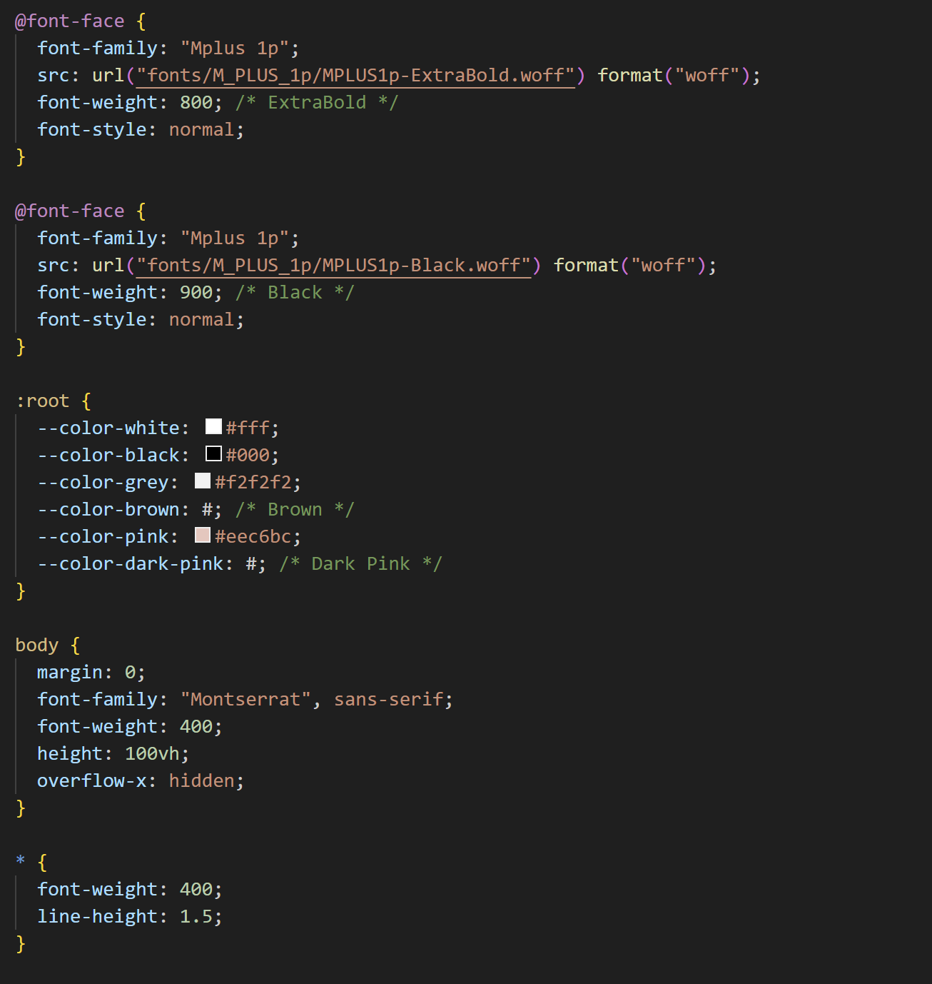
The first thing that I did when starting to code was to organize everything that my team could easily understand everything and have a good experience when coding themselves. For that I first downloaded two of the needed fonts and linked them in CSS. I also created a root element in which we could store some preset variables like colors, so that if suddenly we need to change the whole palette, just by changing the colors in the root, the whole website would change. It also prevents the developing team messing up with those hard to notice things. In my experience having a root is a must, besides without it the tree can never grow). Moreover I made sure that all the text on the website would be generally Montserrat and only the headers would have to be changed.
When coding I tried to replace "divs" with semantic tags like article, aside and so on, so that the code is a bit more readable and understandable for a developers eye. I prohibited the usage of too deeply nested code, thus again improving the readability and also the functionality of my code. I didn’t forget to constantly leave comments before each section or a part. That was done to find the right code faster and also to understand its purpose when you weren’t the one developing it
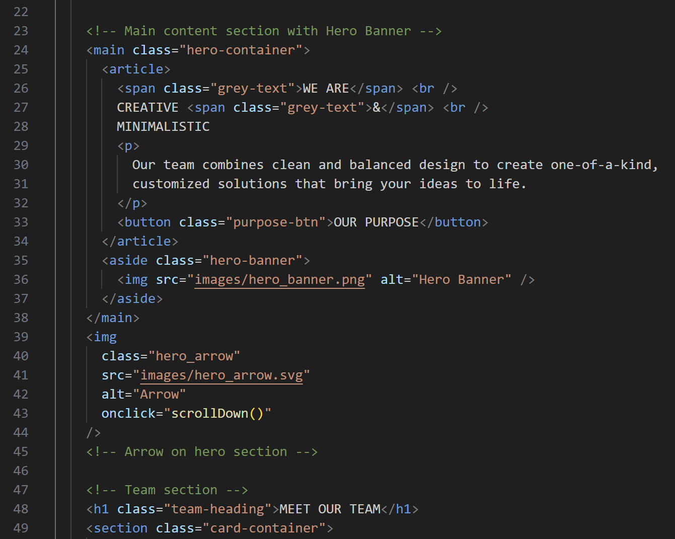
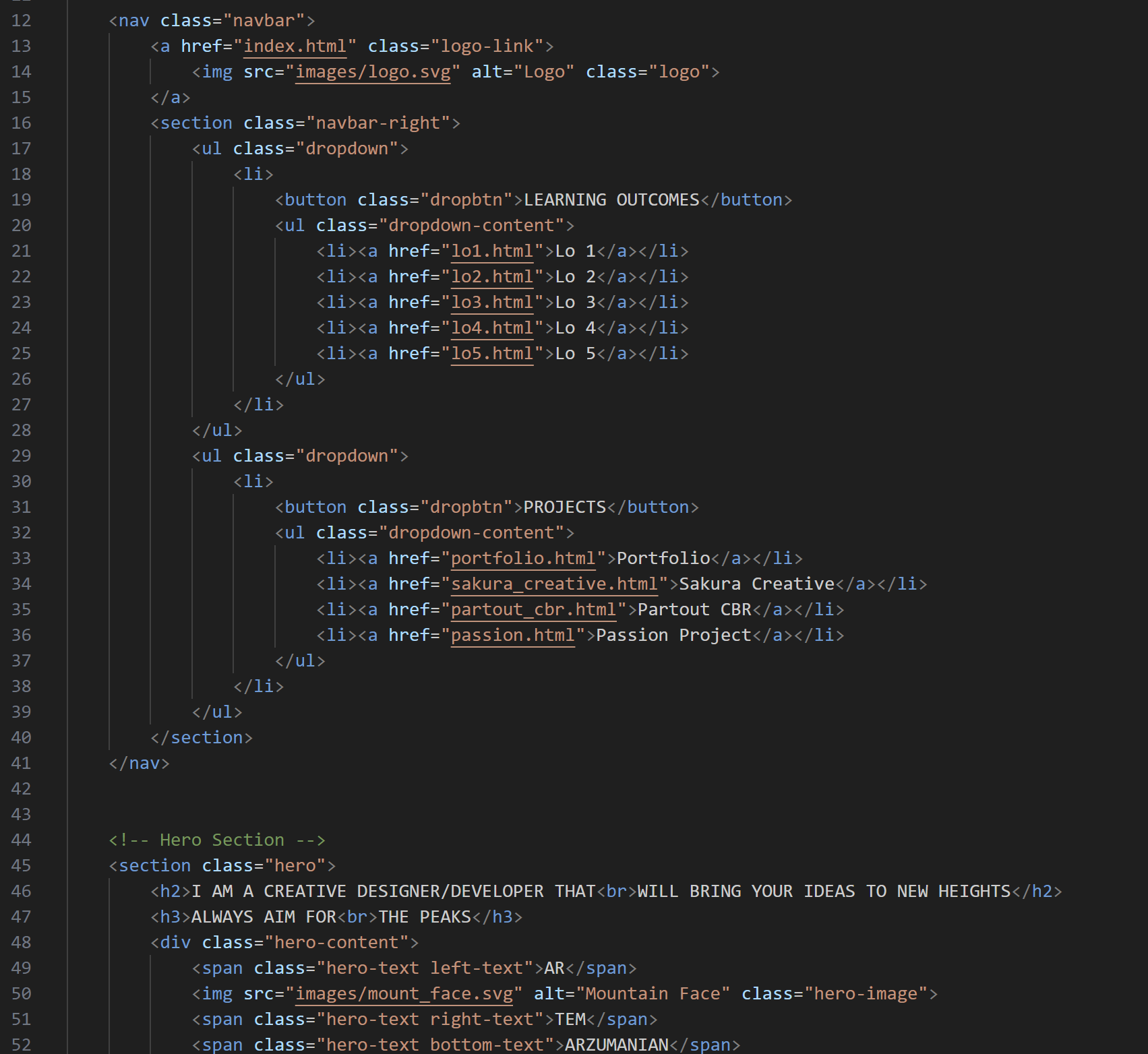
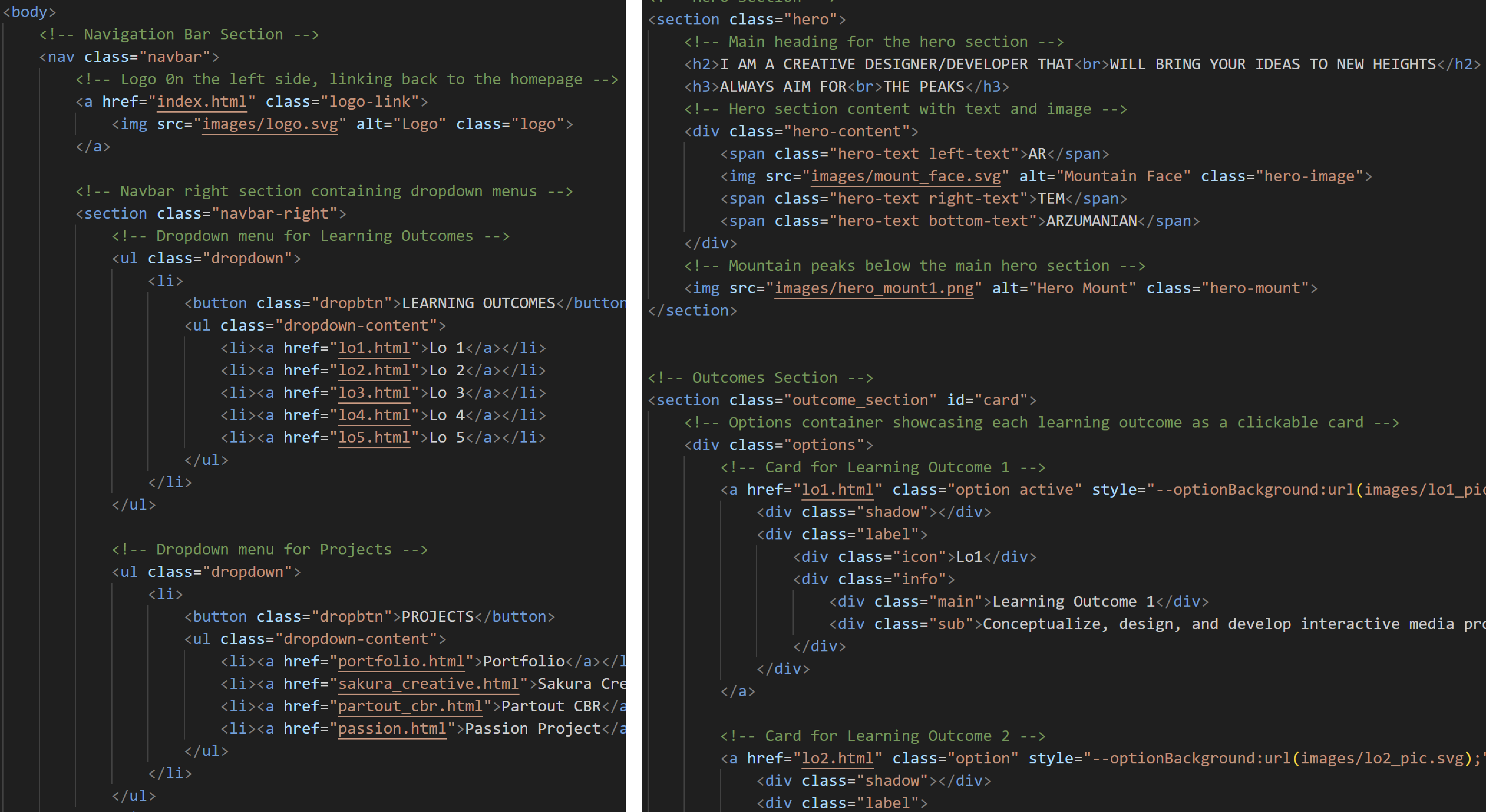
I coded the navbar, hero section and the team section of the Sakura creative website. After preparing the presets, I created a navigation bar consisting of a logo image that leads you to the home page and three buttons on the right side that would link to separate parts of the one-pager.
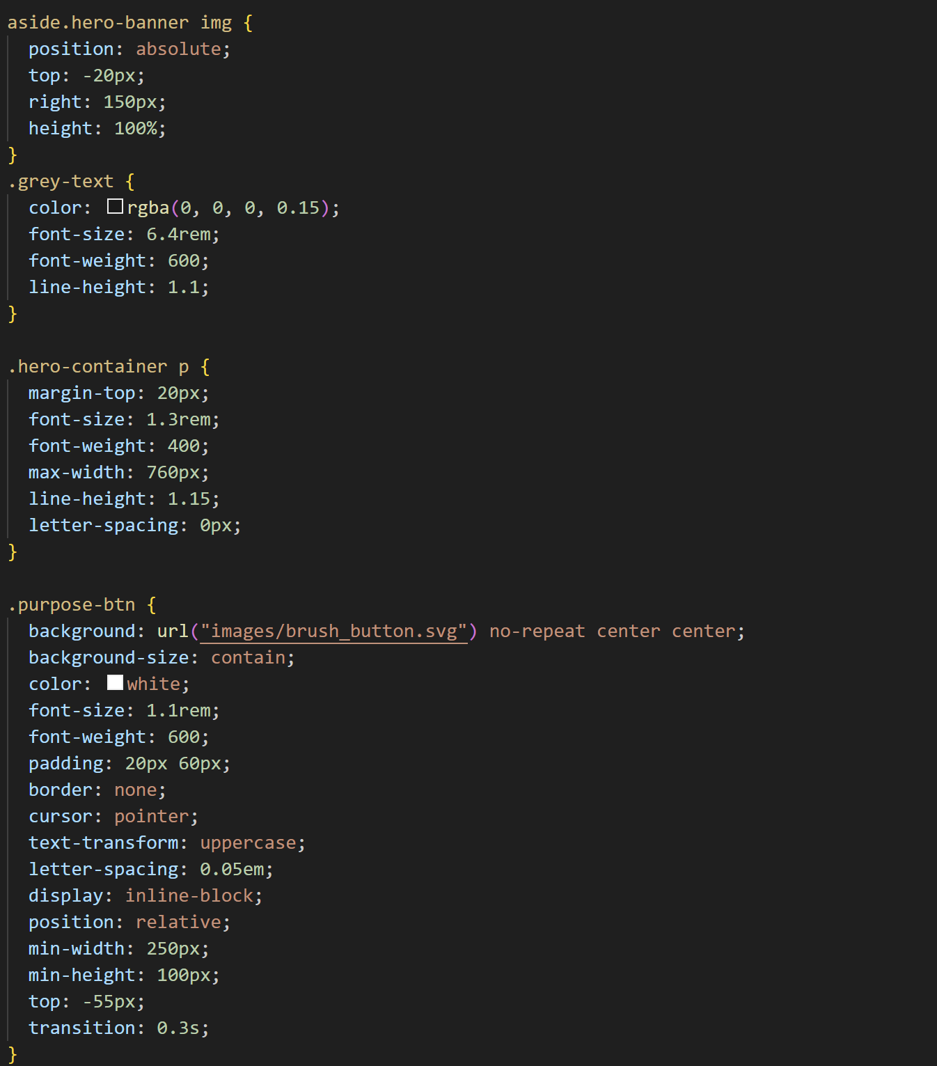
I then added in the banner on the right side using absolute positioning and moved the navbar to the side so it doesn't overlay the banner image. I then put the text and the button underneath and to make some parts of the text be a different color I used the "span" tags.
When creating the team section I used flexbox and put 6 cards under each other. I then managed to put in our names and roles of our team in on the other side and finally uploaded our teams pictures. Finally I noticed that my design choice of using an arrow in-between two sections could result in users trying to click on it, so I made it functional with JavaScript, using a simple command to scroll down the amount of pixels. The next step for me would be making the page responsive and adding in the CSS hover animations.
I have coded the “MEET THE TEAM” section of the Sakura Creative website, so that when you hover the images a special animation appears. I have had this idea a long time ago as I found it online on some professional website, so I asked my teammates to come up with a Japanese themed artifact or an element that I would then be able to add to the website. The sweet thing about it is that we could have our website clean and minimalistic, but still show our personality and creativity. After some time when we all have finished our sketches, I had to implement the animations on the webpage. For that I have prepared the team cards with our images and names and placed the animation images over our cards.
Then I made it so when you hover over the card, the opacity goes up and the image appears. Although this system worked well there was a problem. Mine and Quinn’s animation designs were more sophisticated than others, they had to go both in front and behind the person, which couldn’t work because the animation images were on top of person images. I fixed this problem by tricking the user that the animation appears over it. In reality for those two cards’ animations, I added person images to the animation. When you hover the card, not only the animation appears, but the whole body as well with it, I just had to position it perfectly so the new body is at the same position as the one on the card.
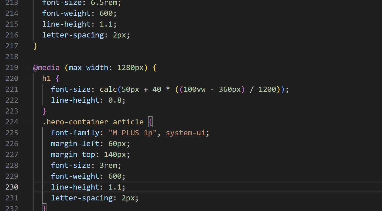
The Sakura creative website needed to be responsive because it would be our main product to show to a client, meaning that everything needs to be up to the standards. To make the website responsive I used media queries. I made it so the moment the website becomes tablet width the website content transforms and the banner goes away to save space. After that a function calculate starts doing its wonders. I have learned from Dirk that I could make it so that with each step of the width size shrinking, the font function would calculate the “steps” and reduce the font size accordingly. I implemented it for the header text so that it doesn't go over the bounds of the phone screen size. I also made sure the team cards stack up in a row underneath each other and their animations still work properly.
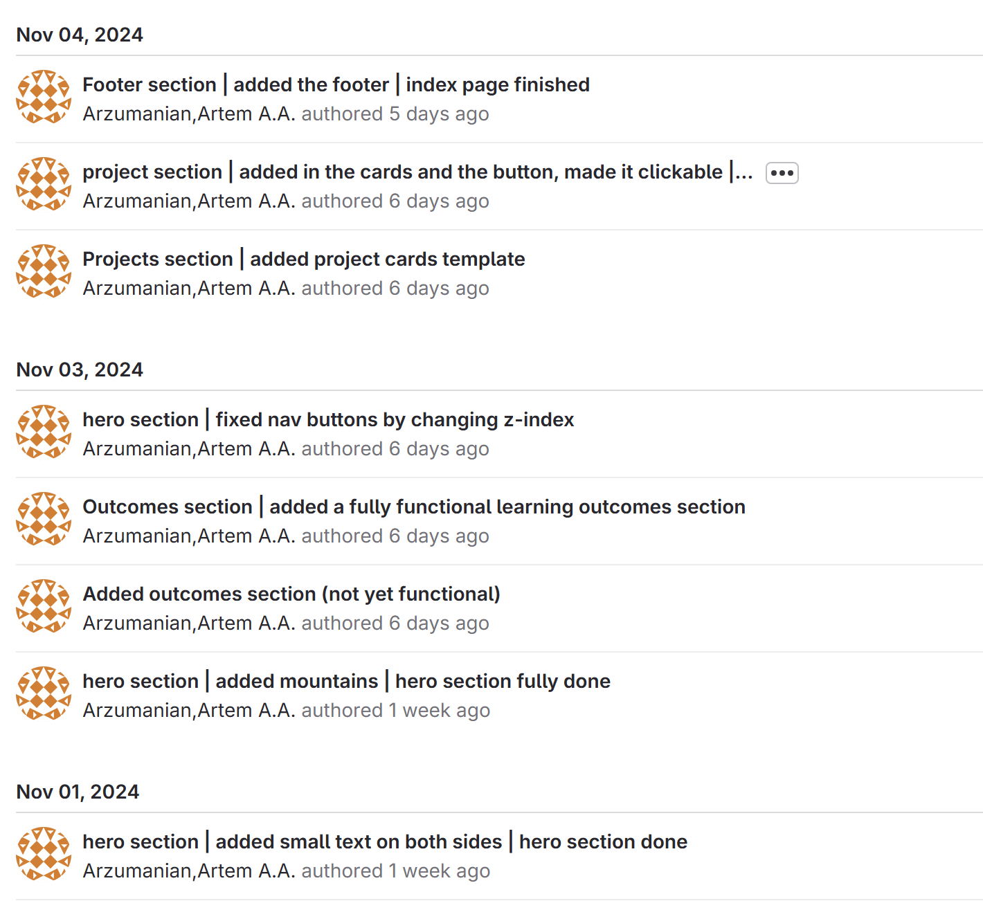
Before starting to code the website I have prepared all the needed elements for the process. I downloaded the fonts and linked them from CSS; I set up the root element in which I have stored some important colors; created all the folders for the images, documents as well as set up all the needed pages for the portfolio to not forget about them in the process. Finally I could start developing the website. I added the navigation bar and the hero section content, then put the learning outcomes section and the project cards and finished it off with a custom footer. Lastly I transferred all the learning outcomes content from my “construction”(1 review version) website to the new website and troubleshooted all the problems.
I used GIT regularly during the creation of the portfolio website. I set up three branches: main, test, tes2 in which I have been coding. The one I worked the most on was test2. GIT helped me a lot with testing out new functions that I tried to implement in the design and animations. I wasn’t sure that it would work and if it may cause other problems, so I created new branches to always have a backup. When committing messages I used the my system of commenting. I first state the page or a section that I made changes in, and then exactly what have I modified. This system is very easy to understand and read through even if you haven’t been developing this website. Overall I had positive experience with GIT and got hang of its commands.
After the second portfolio review I got feedback from teachers that my portfolio website doesn’t have many comments. I needed to change that to make sure that my code becomes easy to read through and understand for other developers and teachers. Instead of just writing something like: “Hero section”, I know added extra information to tell what kind of content is there, where is it located or what it does. Using this structure I have commented all the HTML pages’ sections to tell the reader what the content remotely is like on the screen view. As a result the code became way better visually and navigation vise.
I created a ReadMe file for my personal portfolio. I started the file with an introduction and an overview of the ReadMe content. In the “About the Portfolio” section I talk about what is it for and why do I need it. Then I overview the learning outcomes I have in there and overview the projects I have documented there. Afterwards I show the repository structure of the files to make people aware of the structure and contents of the folder. Then I tell what the key features of my portfolio are and tell about the technologies I used in the creation process. Finally I instruct on how to copy my portfolio on user’s workspace and give my contact details. It was the first time I created a ReadMe file and I really enjoyed structuring out the contents.
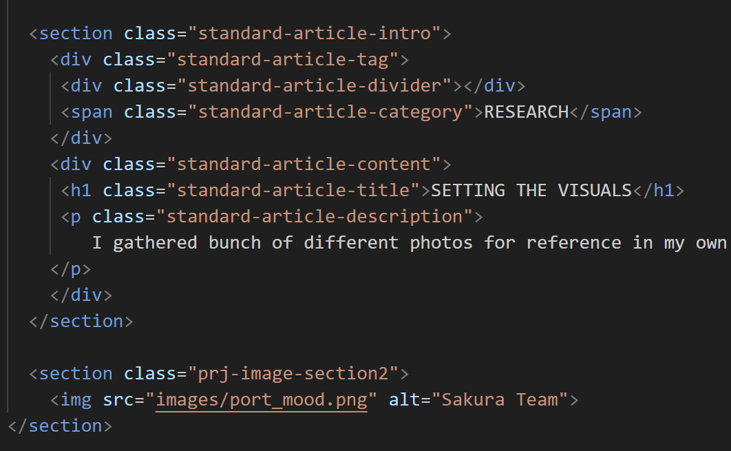
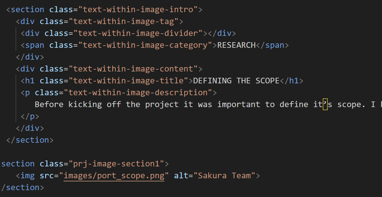
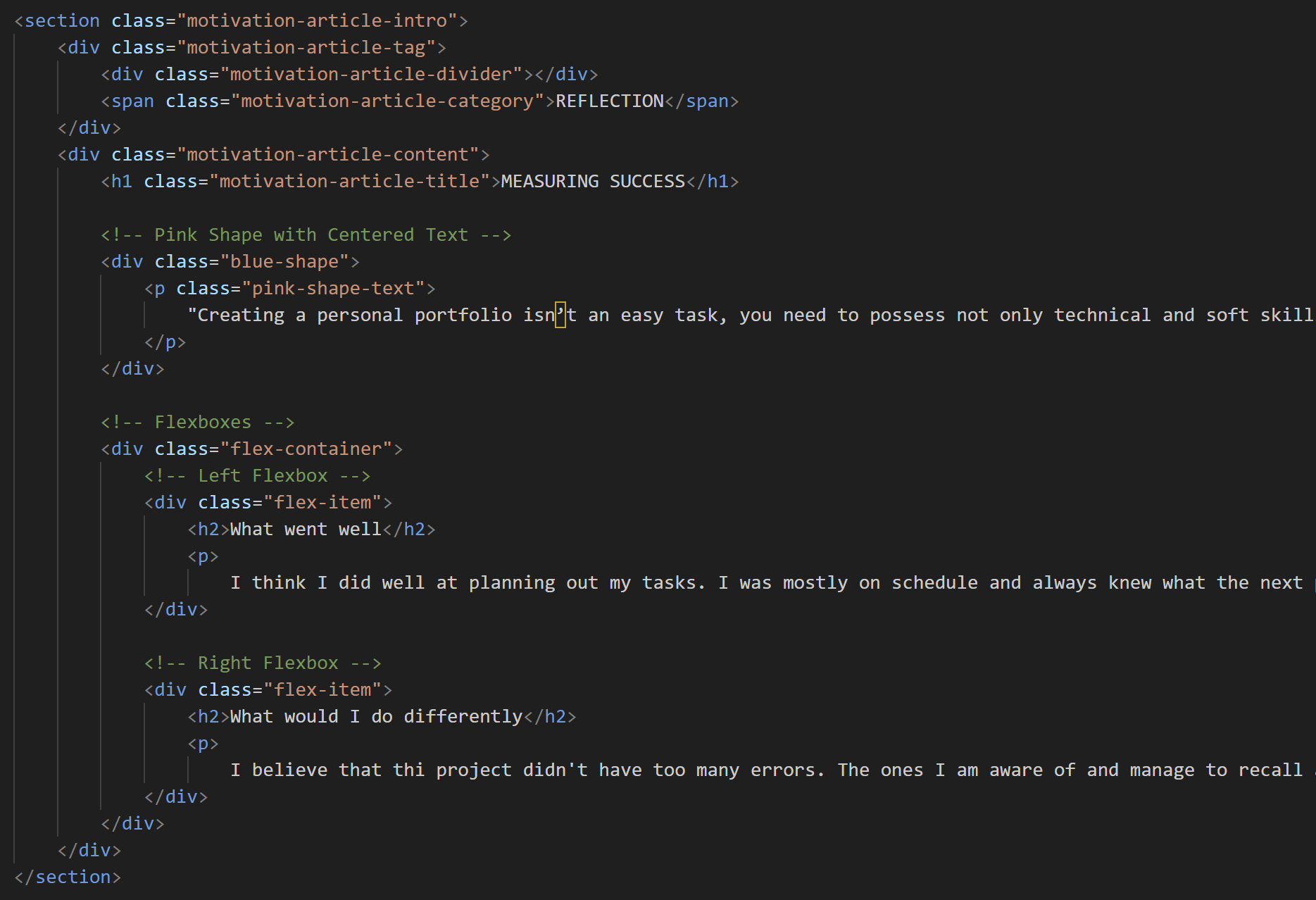
I made sure to make the projects designs interesting and highly designed, but to still be easy to program. That way I ensured I could reuse the same structure and sections over different project documentations. I have coded the cover pages first in which there would be a description of the project, my roles and the logo. Then I created two templates of topic articles. One of them was with a bigger margin between the article and the image under it, and the other templated had a small gap between them. This was done to be able to interchange between them now and then for a better content placement. I then added in the web section that would contain a mockup of the product I made and would have a magnetic button that would lead to the product viewing. Lastly I coded the reflection section in which I would measure the success of the project. The structure of these pages is consistent across all projects and goes like this:
├──Project Cover
├── Challenge statement
├── Phase 1
│ ├── articles
│ └── iamges
├── Phase 2
│ ├── articles
│ └── iamges
├── Phase 3
│ ├── articles
│ └── iamges
│
├── View final product
├───Reflection
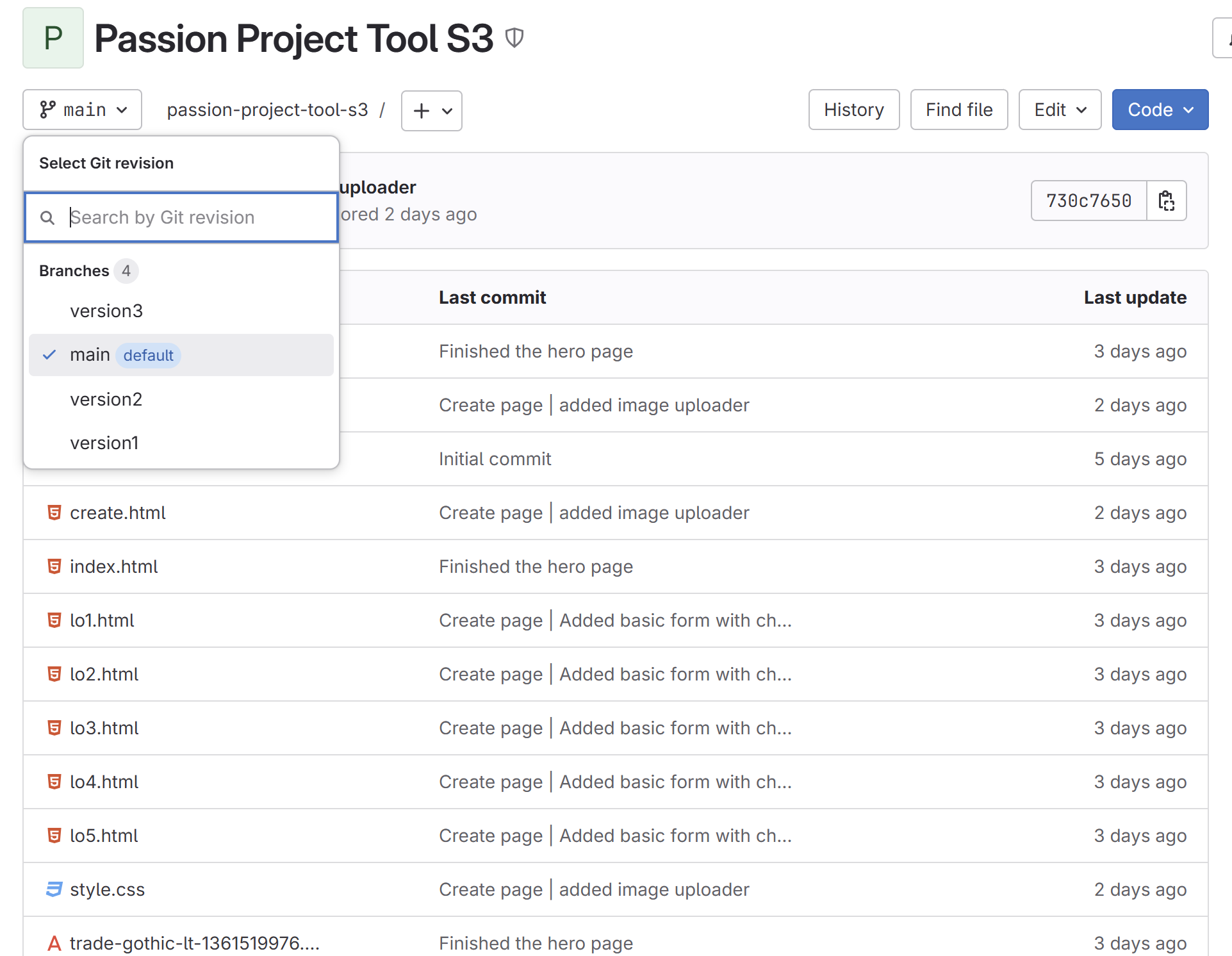
The passion project was a heavy coding project. I was learning in process and till the end didn’t know if I could fully finish this hard project. To not screw this up I made sure to use GITlab’s help. I created a project, pulled it into VsCode and started coding the tool that would create and publish learning outcomes articles. I used branches as my version control that would store a working version of the tool I have made. This way I always know, that even if the new feature I tried to integrate messed the code up, I could always pull the previous version to my laptop. By the end of the project I had 4 branches: main and version1-3. I found the usage of Git extremely helpful as without it I would have needed to restart the project from scratch.
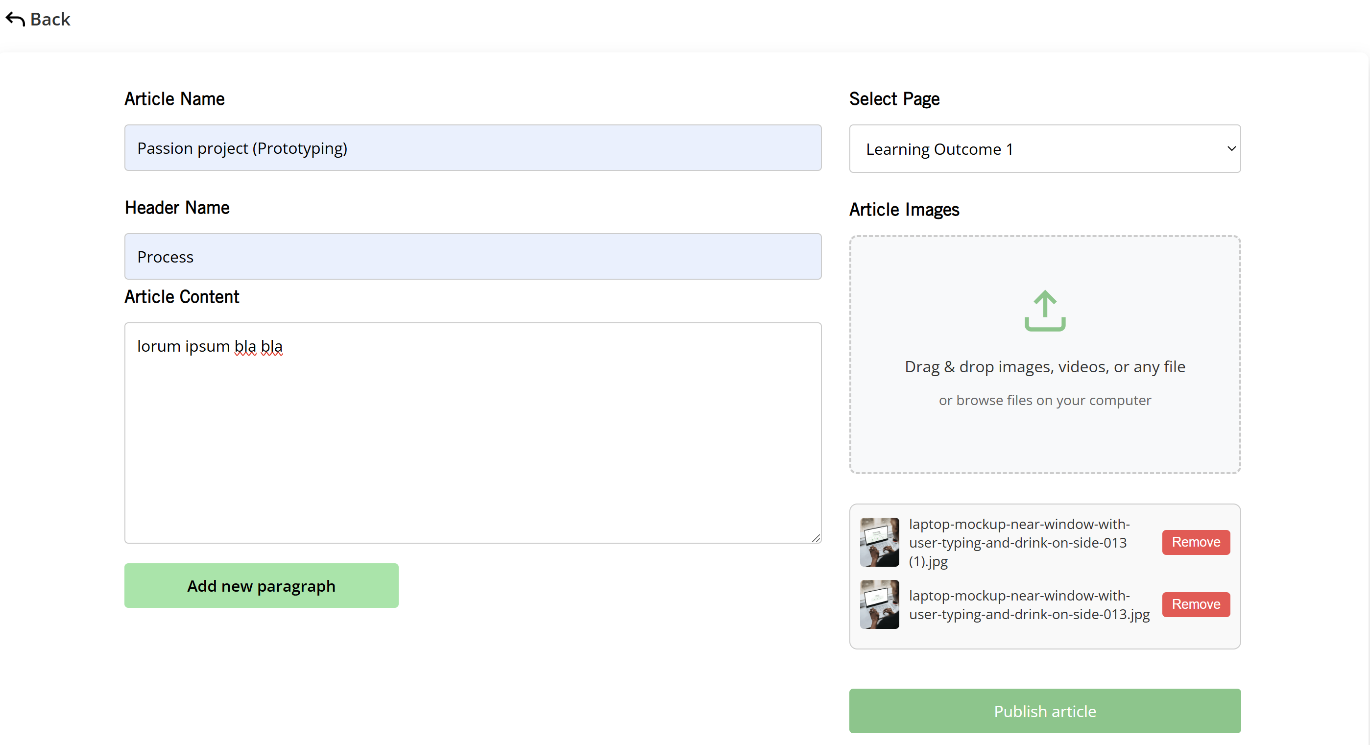
During the passion project I was developing a tool that would publish the learning outcomes on the page you want without you having to code. The first page I took care of was the Create page, in which you enter the data to publish.
First I created the html file that included input forms for the article names, headers and text. If you wanted to be able to write more, then the JavaScript creates new paragraph sections when the "Add new paragraph" button is clicked. I then developed and styled the file upload system and using JavaScript made it handle the files you uploaded. It handles drag-and-drop file uploads, previews the uploaded images, and allows users to remove images. Another feature I have added was validation system. Before saving, JavaScript checked if all required fields are filled. When submitted, the data is collected and saved to localStorage. JavaScript and HTML interact through DOM thus allowing the webpage to adapt and respond to user input in real time.
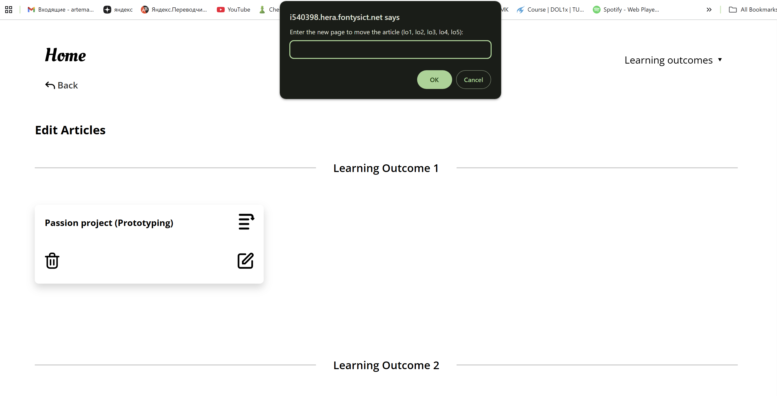
The second page to code for the tool was the edit page, that allows you to delete, edit, or move the learning outcome.
I have created the edit.html file that contained headers for each learning outcome and dedicated areas for article cards. When you create the article in the create page, the card with the name of that article appears on the edit page under the needed LO name. Each article appears as a card with buttons for editing, deleting, and moving it. The "edit" button redirects users to the Create page with preloaded data for the selected article, enabling you to update the text and images and save them back in. The "delete" button removes the article after user confirmation, while the "move" button allows users to relocate the articles to different LO sections by specifying a target page. When doing so the actual article moves to the needed page accordingly to the card you just moved.
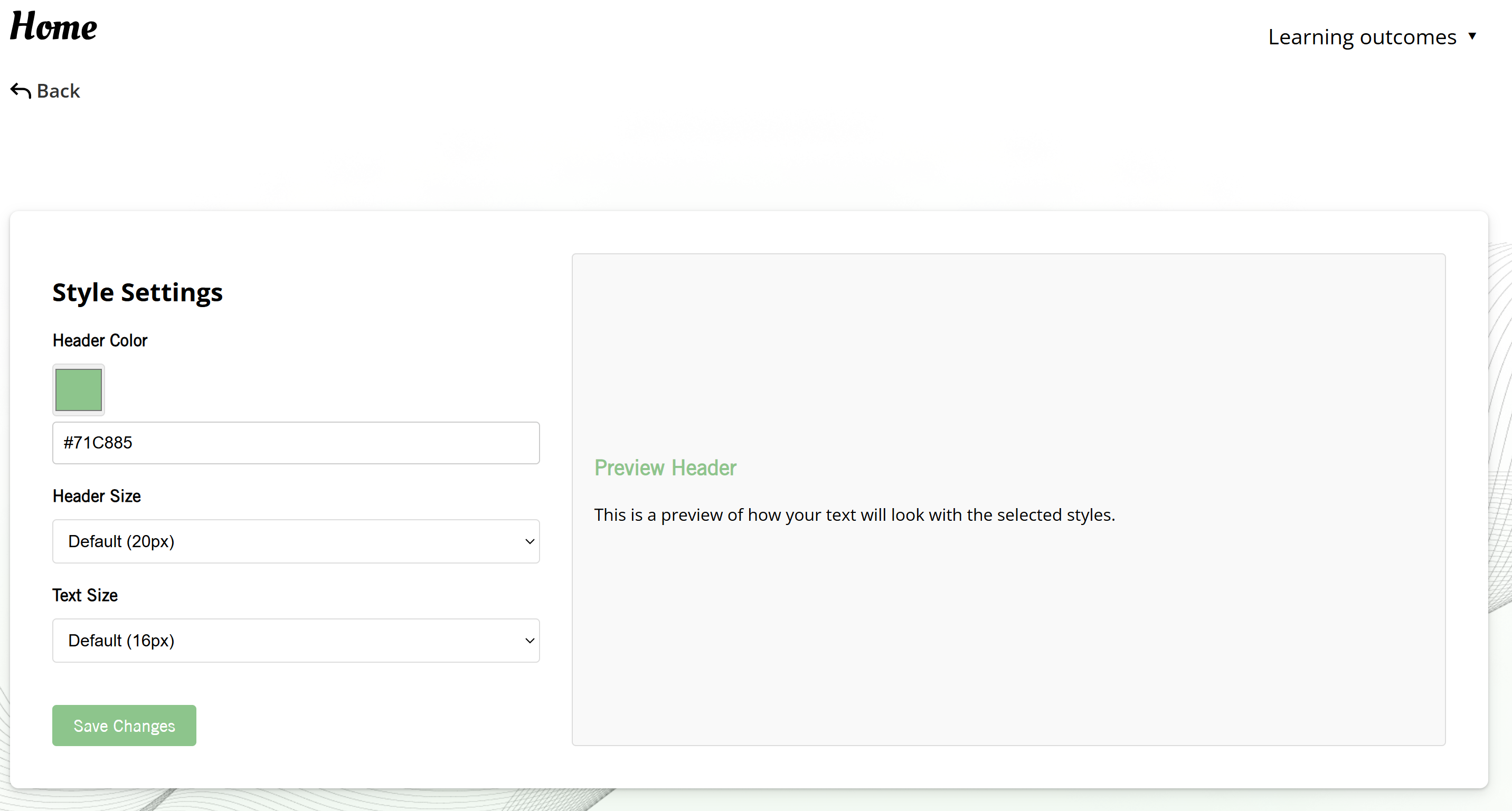
The Style page of the tool allows you to change the looks of all the learning outcomes’ articles, old and new. It allows users to style the text however they like, according to their preferences.
I created the settings section that allows users to modify the header color, header size, and text size. For the header color, I put in both a color picker and a manual HEX input. Users can select different sizes for the headers and text from dropdown menus and then save their changes for them to apply. Using JavaScript, I connected the input fields to CSS variables, enabling real-time updates. The coolest feature of the Style page is the live preview on the right side. This section dynamically updates as users adjust the style settings, so they can instantly see how their chosen customizations will look like on a learning outcome article.