LO3 - Creative iterations
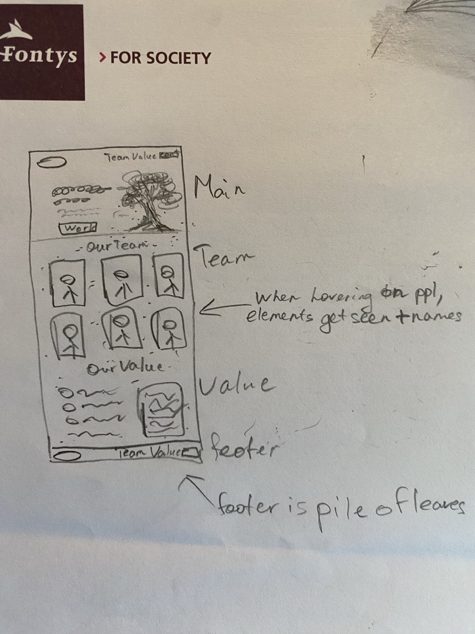
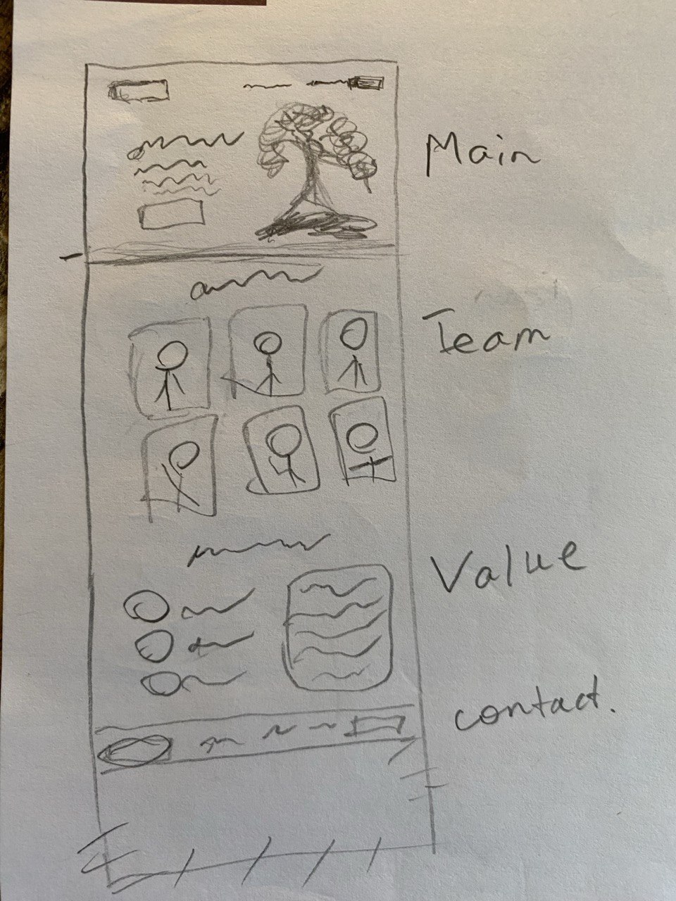
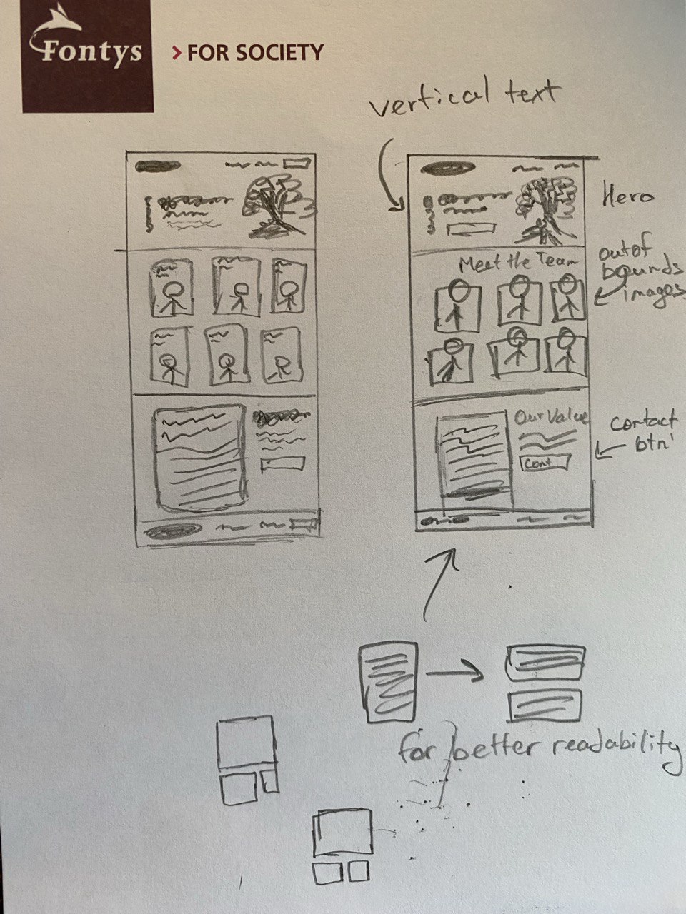
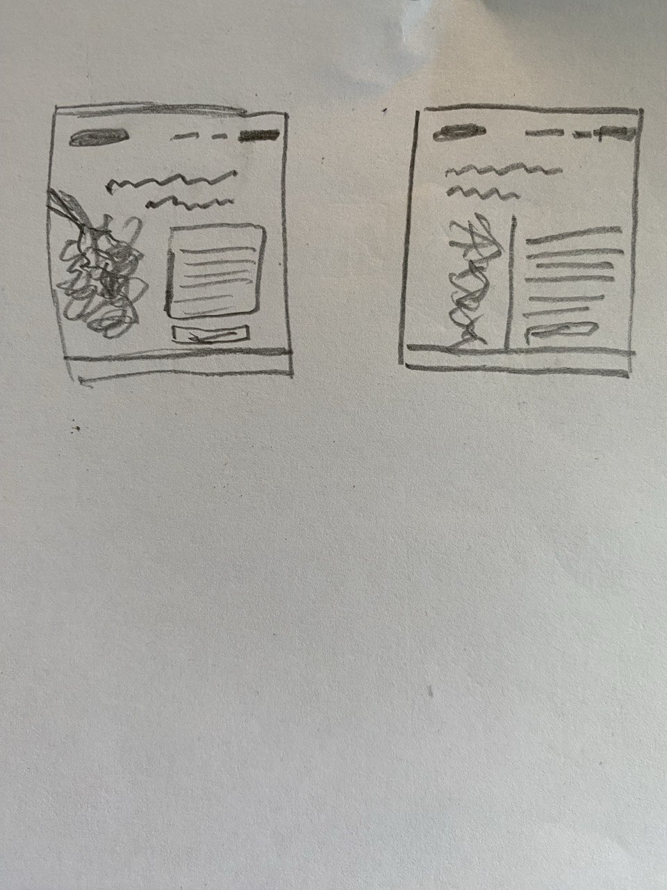
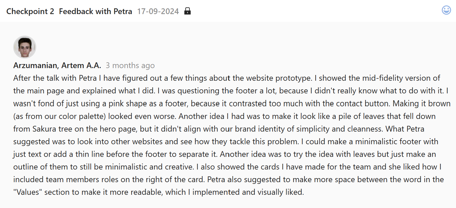
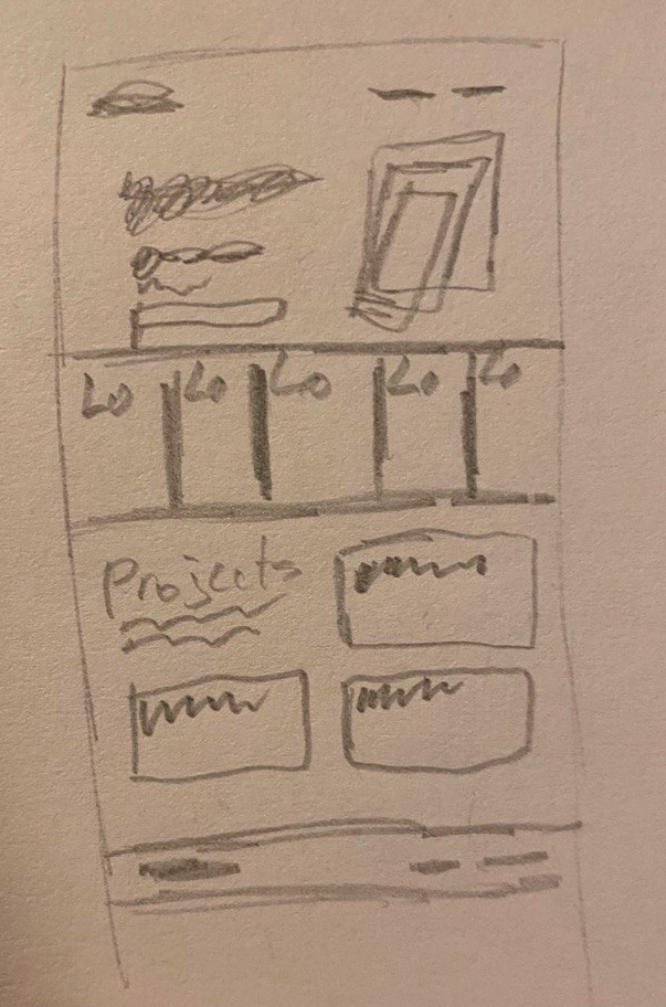
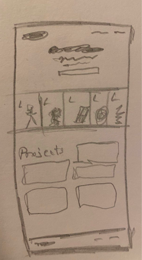
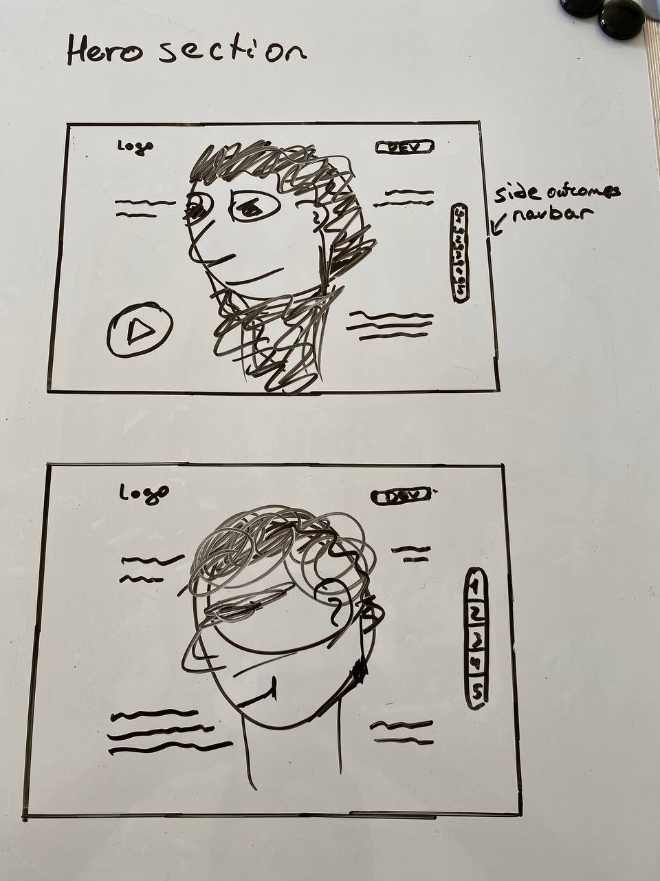
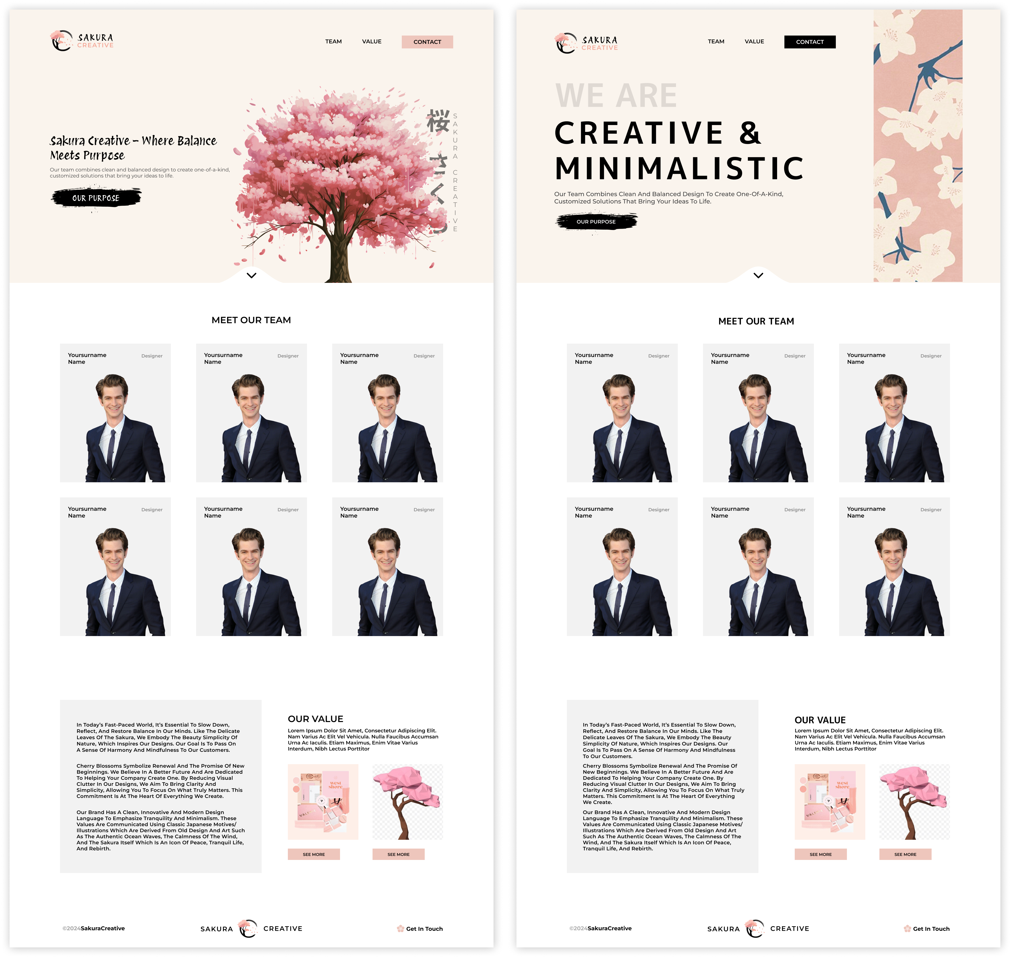
In order to create a website for Sakura Creative I first needed to figure out what information it needs. I had an idea to create a website to use it as a CV and as a way to introduce our team to the client. Within the website we could directly link to our brandbook and the 3d Model of the Sakura tree. If done properly, it could set us apart from our competitors by a mile. To start with this task I first drew a couple of sketches to see what kind of content needs to be where. The primal idea was to make a simple website that would have a hero section introducing us, then a team page where we could show our group members and our roles to create trust, and finally a Value section in which we explain our purpose and link our work. I iterated the sketches based on the feedback from Dirk and my peers, creating newer versions of a prototype. I came up with a way to make the team cards consistent but still show our originality by using a hover effect that would reveal the drawing on top of the card. I also experimented with the usage of vertical text on the hero page h1, because it aligns with the Japanese style. Moreover I drew a small contact us page leaving space to write on the right and a drawing on the left.
I think I managed to generate some good ideas on paper and also presented them well to the teachers, so that they approved me taking this concept to the next step.
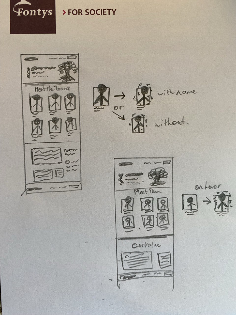
After completing the sketches of a team website I created a Figma wireframe to see how the content looks in digital form. I tweaked it a little and after getting feedback from Petra, began to fill in the content to create a higher fidelity prototype. I put the slogan “Sakura Creative – Where Balance Meets Purpose” on the hero section, added a tree and completed the nav bar on the hero page. When getting some feedback from Petra, I got suggested to write in the names on the left side of the team cards but also add a team role on the other side. This way we also present what skills we have in our team. So I put up the roles on the right side making the text smaller and dimming the color, so that it doesn’t take too much attention from our names. Then in the Values section I implemented small images of the products we will deliver, as in the brandbook and the 3d model. On the left side of the products there is a grey box that would contain our teams identity text to show that we have a deeper meaning in our work.
I presented the website prototype to the team and they all liked it, the only thing some of us weren’t fully sure of was the hero section. We all agreed upon creating many more iterations and versions of it, to then combine our ideas and get the best result. I tried various styles, like a center, left and right based designs, as well as tried different text and button placements.
After combining my work with others, we were able to create two final versions from which we then picked the one with a vertical banner, so we are not to focused on the tree. I think both versions turned out great, I was leaning more towards the one with the tree at first, but then we had an idea to implement the 3d model of the tree in the banner somehow, which was also a very interesting solution that we could try.
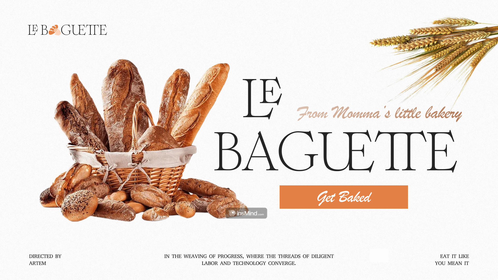
In one of our UX lessons from Stan, we practiced iterating a hero section. Stan gave us a starter page with a little content, some text and two loafs of bread. We were given ten minutes to create something interesting from it.
To start of I first tried resizing the bread, because there was too much white space. Then the problem occurred that the text was overlaying the bread, so I decided to move the first part on top, make the bread smaller and fit the empty space I created and also added some hay. Next thing I did proved to be a massive breakthrough. I realized that there is just not enough bread on the page so I quickly found a picture with a full basket of it. I then noticed the perfect opportunity to mimic the angle of the sticking out bread with the “LE BAGUETTE” text. I then changed the font of the “From Momma’s little bakery” text to match the design and be more readable. Next I realized, that a call-to-action button was missing, so I added it under the h1 text and moved a subtext to the empty space next to “LE” text. Then I wanted to change the logo. The first thing I thought of about a bakery shop, was the action of taking the bread, so I found the bread and hand icons and combined them so it looks like someone is grabbing it. I noticed how those icons reminded of a letter “a”, so I integrated it into the logo name itself. Lastly after playing with colors, inline text heights and text cantering I created a final version of my hero page.
I enjoyed this practice a lot and learnt many new things from it. I didn’t fully realize that my brain could quickly connect the invisible dots, find the connections and kind of lead the way in design itself.
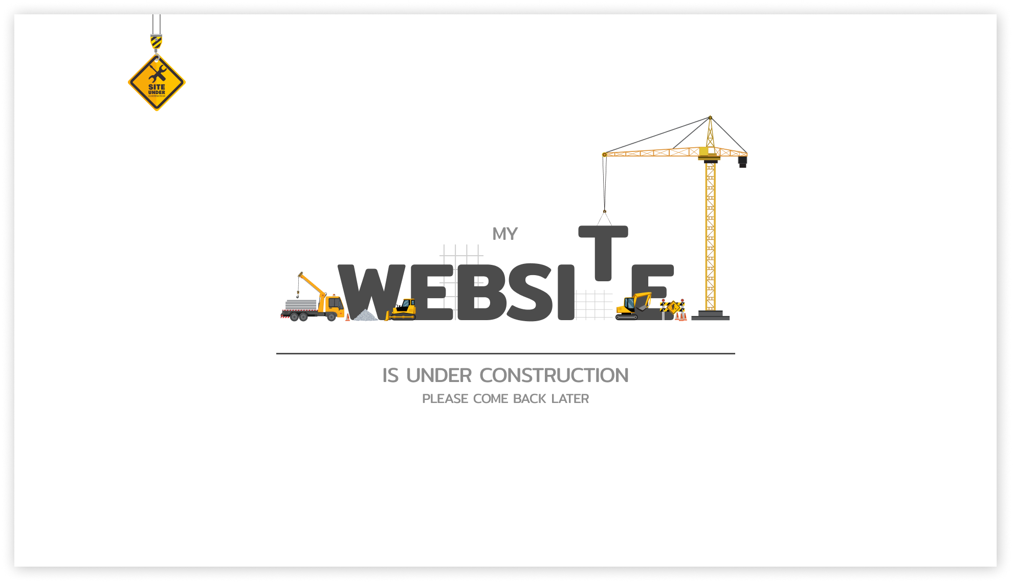
I wanted to have a website for the first Review. It was a difficult thing to do considering the time limit, my role in the team and presentations from companies. So to approach this task I chose a safe plan of writing in the learning outcomes in Notion and then I would decide if its better to put stuff on a website of a PDF. I managed to finish writing the last learning outcomes a day before the deadline. So I made a choice to try and speedrun the website building. I didn’t need to design the page but I needed to structure the outcomes and make it easy for teachers to find them and read them. So I started filling in the content one by one. I finally put in all the content and saw that I still have a bit of time before the deadline, so I decided to make the hero section more interesting.
I found some inspiration on Pinterest, as I was searching for designs of the websites that were “work in progress”. I found many images with literal construction working on the page and decided to do exactly that. I put the reference to Figma, found svg assets and began working. I put in the text “website” found a good font and moved up one of the letters in the air to hook it up to the crane. To spice the scene up I added more vehicles performing some tasks and overlaying the text to add depth. I then added the subtext on top and the bottom. I also found a vector of the construction sign and because it was hanging from top I put it to the left top corner and realized that I suddenly came up with a logo, the last thing missing were the navigation buttons that I added on the website itself.
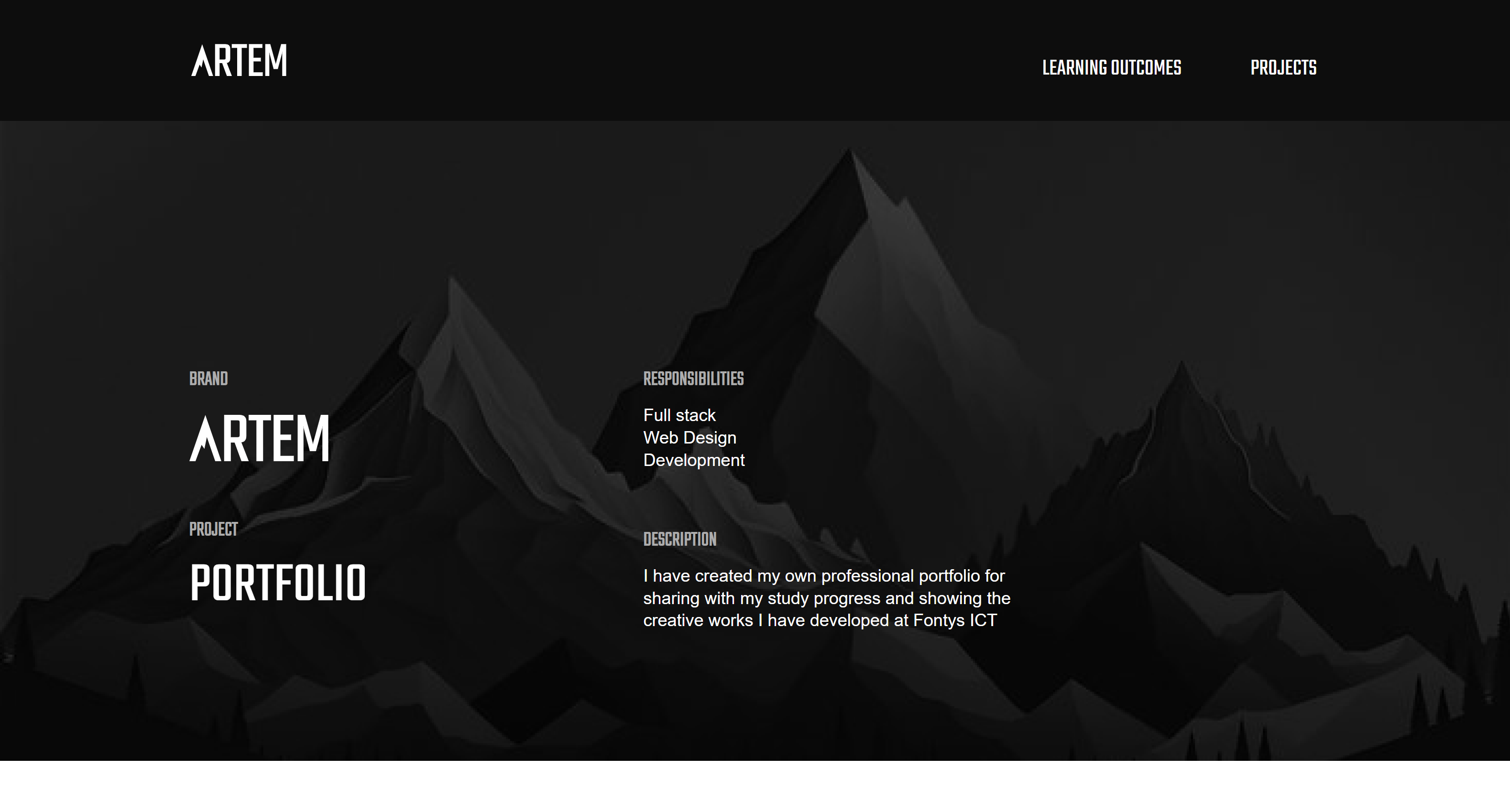
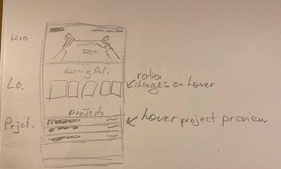
This semester I want to create a portfolio with the Armenian style. This means I have to try really hard to create a stunning website that is still very efficient and digestible. I managed to create a couple of sketches to see what I can create for the website.
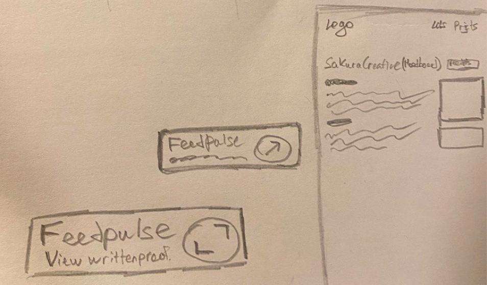
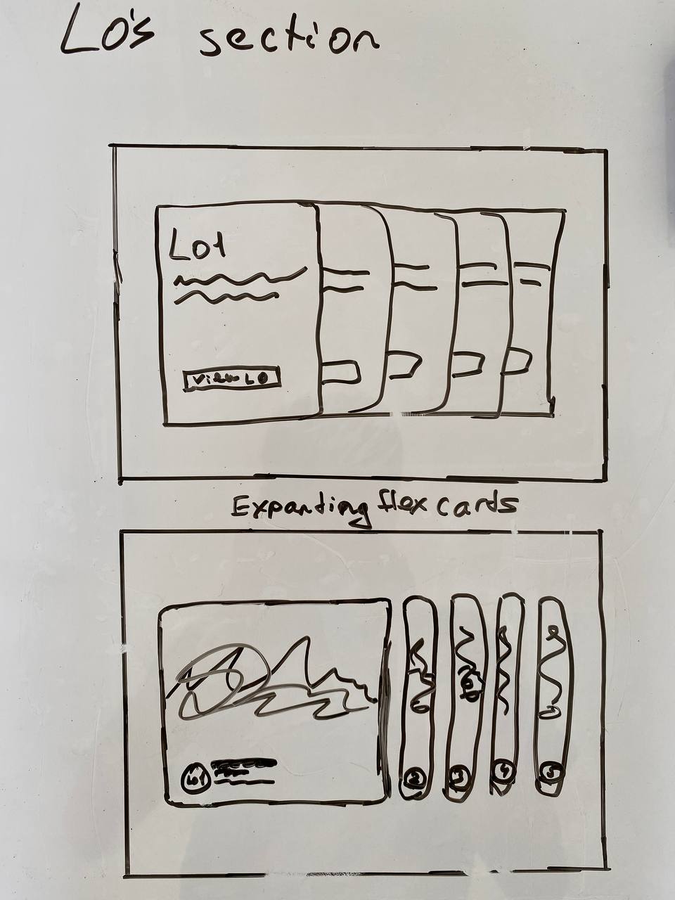
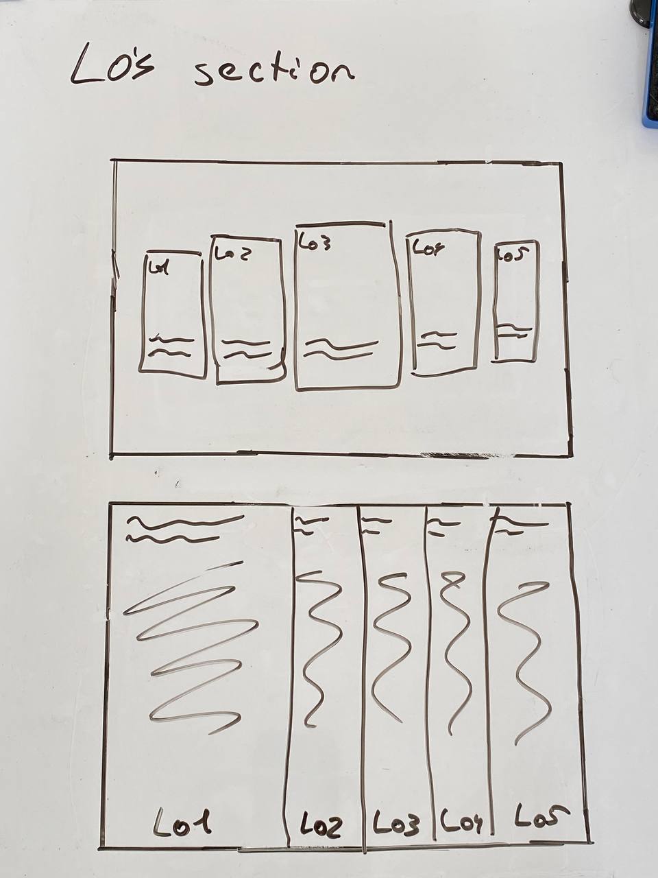
I started with a simple website that would have a center based hero section, then 5 learning outcomes cards with interesting imagery and finally a projects section. I then tried integrating Armenian culture into the hero section by adding many people performing a national dance. I also tried rounding up the top of the outcomes cards. Then I iterated the projects section based on some examples that I liked from professional websites on Awwwards. When hovering the project it could give you a peek on the images or the website. Later I tried pushing the projects section to be full width rather than left based and made the learning outcomes card change their ratios on hover. I also thought of the way to draw a feedpulse badge that I would use to show proof for an outcome. This way I would save lots of space, while still providing the needed content.
Overall, I have many solid ideas that I could bring to the next level, the next step would be to start creating digital prototypes.
After the first review I came back to sketching and ideating on what my portfolio could look like. I decided to switch my theme to mountains so that I could create an Armenian styled website in the next semester, when I am more skilled.
I grabbed my board and started sketching our some ideas on it. I wanted to have a center based hero section with my face in the middle and text around it, then to have some sort of a cards system for the learning outcomes and lastly, my favorite part, the projects cards that would contain a name of the project, a short description of it, and a button to view the study. I wasn’t yet sure about the hero and lo section so I kept on iterating them, but I absolutely loved the project cards and imagining how it would look like in my head, I knew I want to keep it. I tried implementing the sidebar to the hero page and make it fixed, so you can always access the learning outcomes from there and also created other versions of the lo section.
At that point I decided that I have what I need to start creating a Figma prototype of the website, so I went on to do that. I think that the sketches turned out good and they definitely helped me out a lot in the process of designing the website.
After completing the sketches I created a wireframe of the portfolio website.
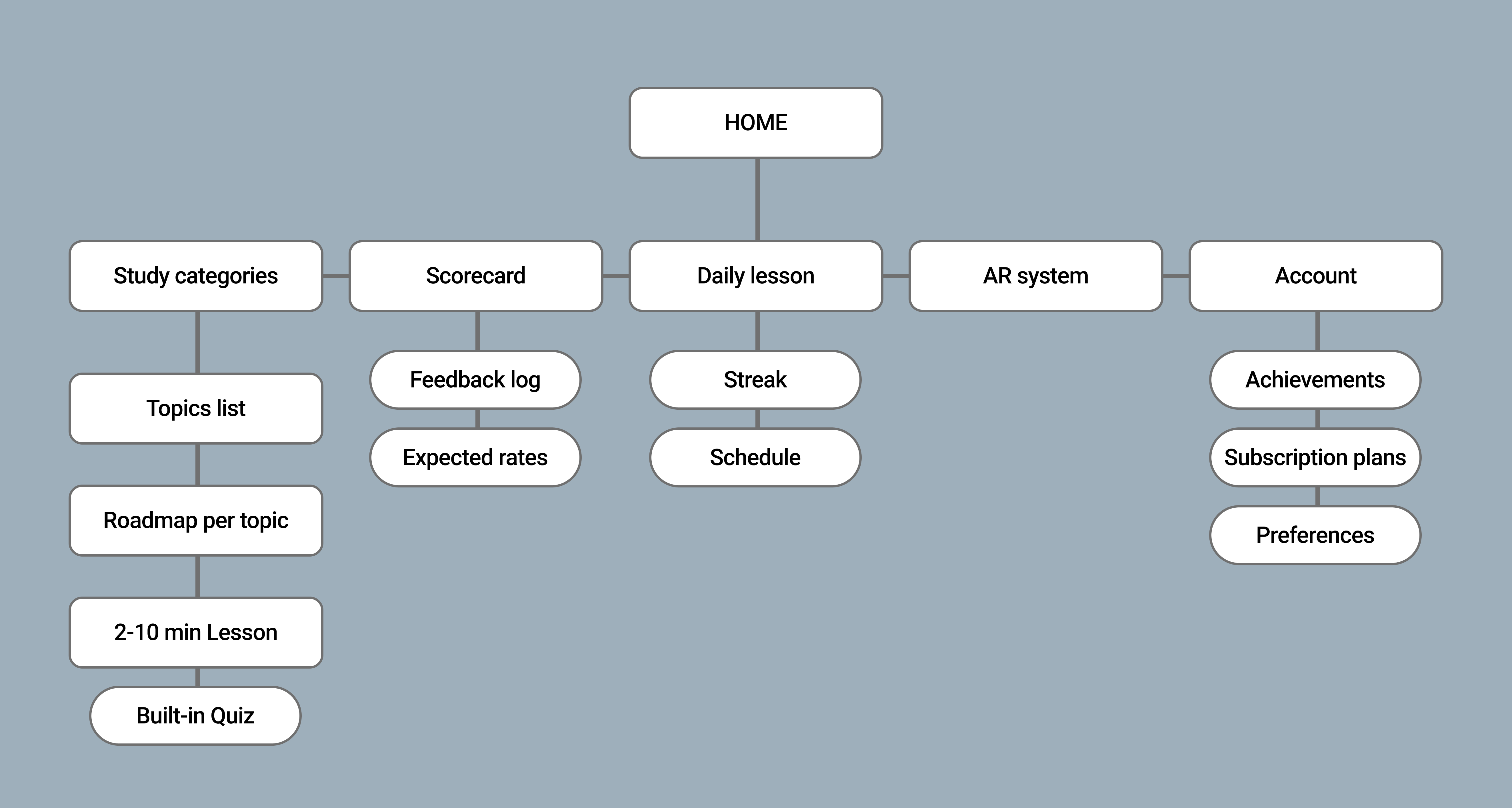
In the process of sketching and creating a wireframe I came up with an idea. What if there was a Feedpulse like system, but for a portfolio. A system in which you could write in the learning outcomes directly from the website without ever looking at the code. I called it the Dev page and have created a sketch of it which I out next to the wireframe of the website. As for the wireframe I got myself the hero section with my image, learning outcomes section and the projects cards and I explained the functionality and purpose of all the design elements with special comment tags. I also created a Site map to set a navigation system of the portfolio.
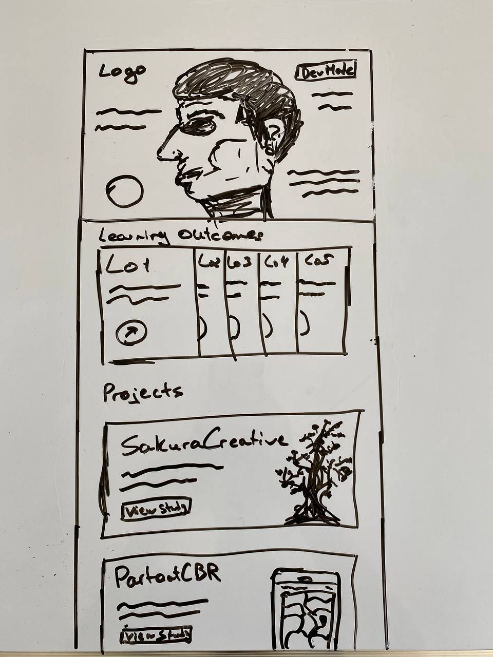
I got feedback from Dirk on both the wireframe and the dev page idea and he liked them both. He also questioned the sidebar usage, that I could just use the navigation bar and put the learning outcomes drop-down button there. I also got feedback to make the dev page invisible for users, so that no one but me knows it exists. This way, I could just enter the link name in the search bar and from there would be able to log in and use the dev page.
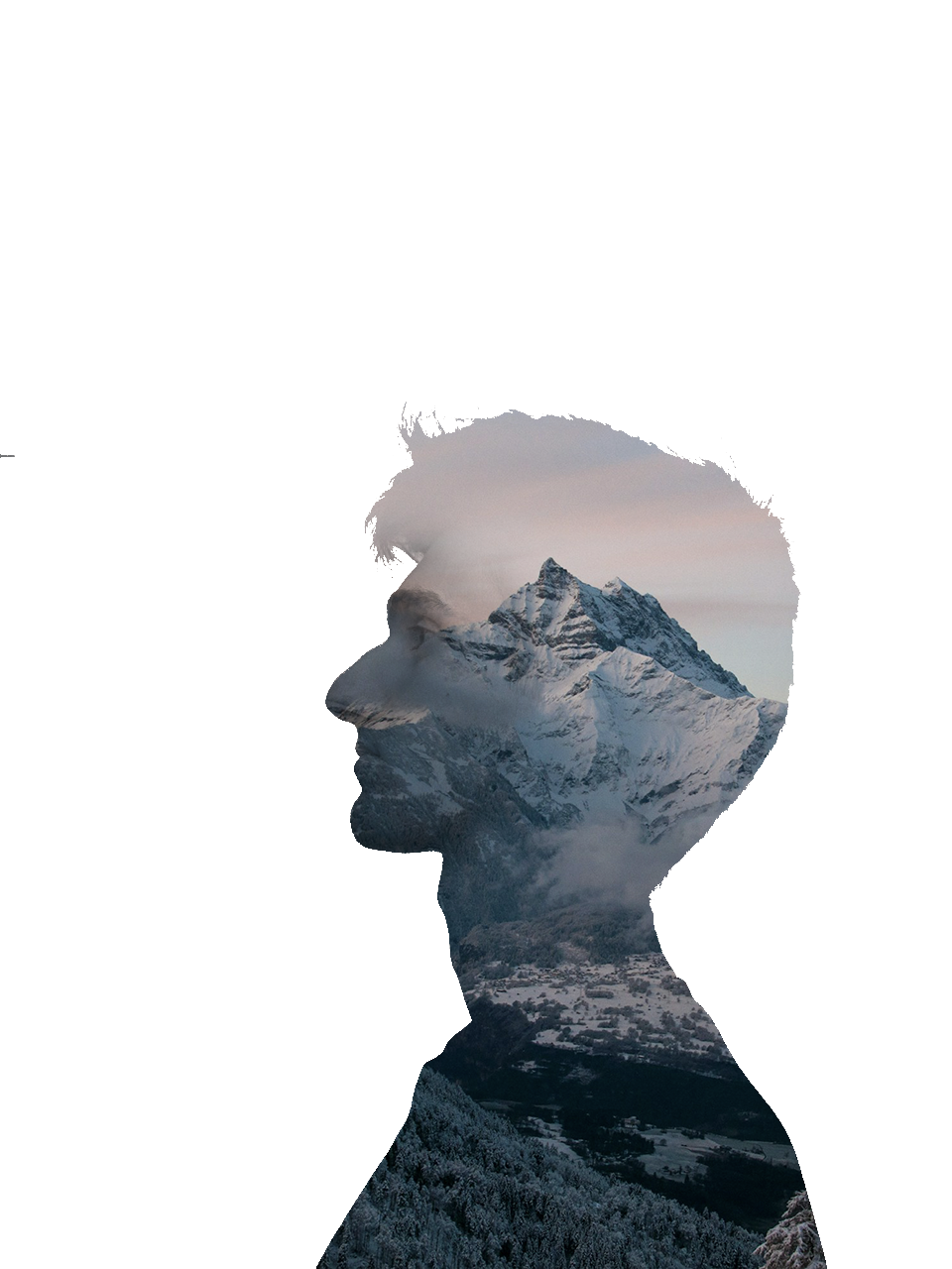
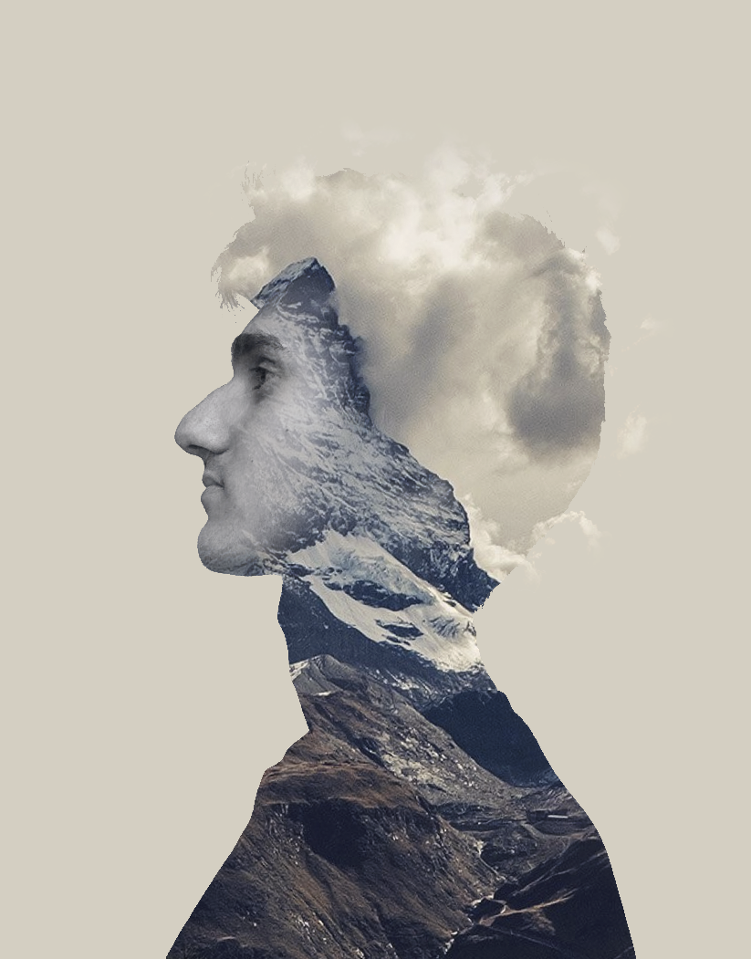
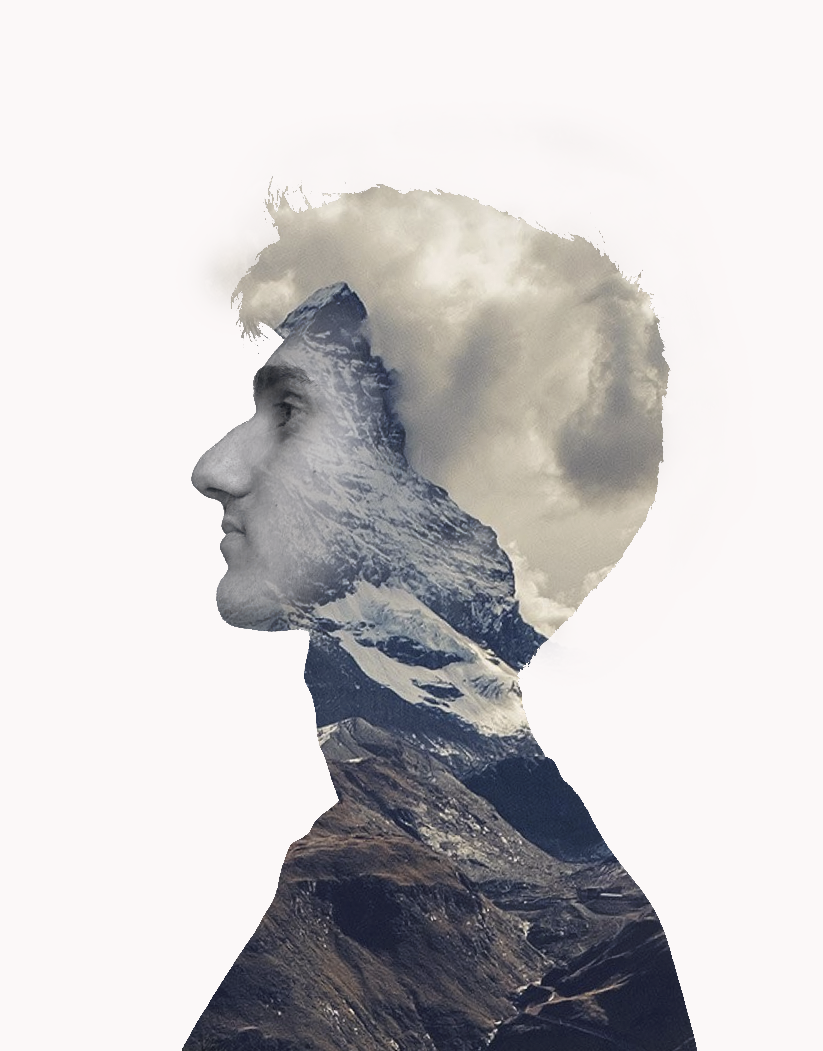
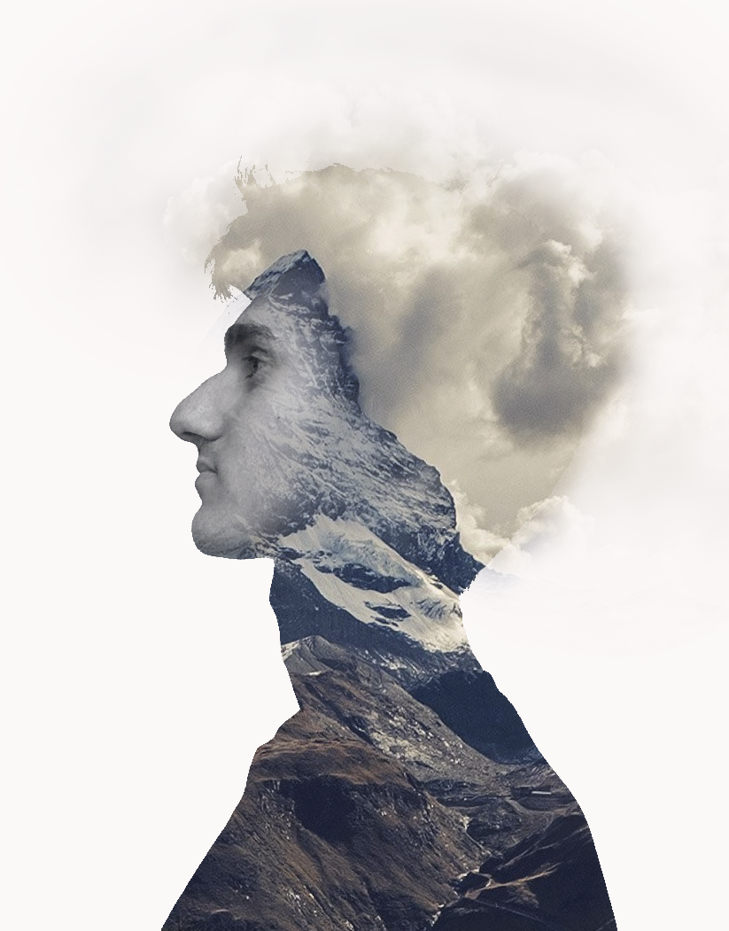
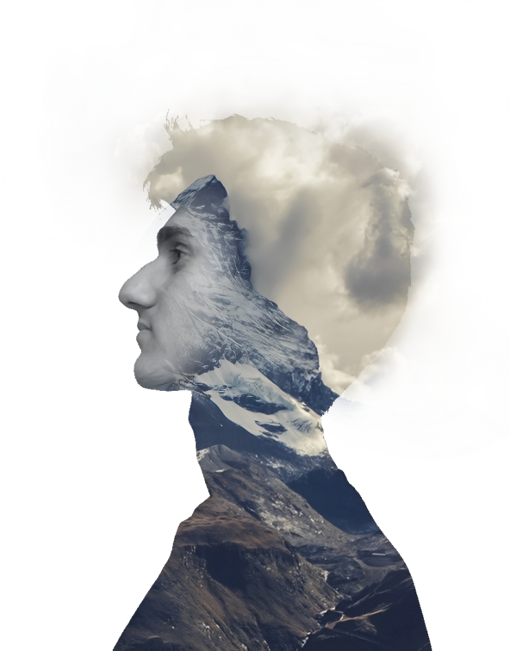
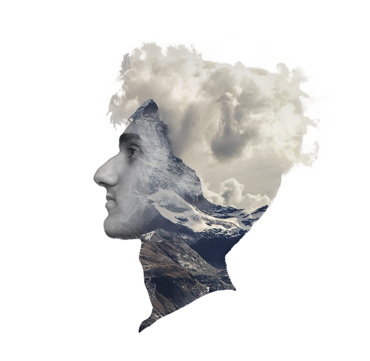
I created a moodboard for my portfolio and I noticed that a lot of images were an image inside the image. I showed it to Stan and he said that is called double exposure, which he recognized from series “True Detective”. We had a conversation about it and he showed me some tricks of how to make it. I loved that and imagined how cool it would be to create mountain double exposure with my face.
I found some tutorials on Youtube that tought how to get the effect of double exposure, so I started looking for mount images that could fit my idea. I also took a side photo of myself and edited out the background. After I gathered all the assets I started creating first versions using Photoshop. After some tries I realized that there is always the cloudy sky at the top of the mount, so I could use this to my advantage. I aligned the mount with my “hairline” and blended out the top of the head, so it seemed like the clouds where going out of bounds. I liked this a lot and experimented with it. I then decided to try a version where there is only the head floating , so I cut out the bottom part of the image and used the clouds to replicate the hair.
It was my first ever experience with Photoshop rather than removing background and I must say it was amazing. It was fun to do and the result is mind-blowing.


After getting feedback from Dirk about my wireframe, I went on to create the final one with all the new iterations.
I iterated the navigation bar, adding in the two buttons to view the learning outcomes and projects instead of having a dev button. I decided to remove the sidebar navigation fully because I found a better solution. At the end of each learning outcome and project pages I would have a cards to view the next thing. This way I am keeping the user engaged and am always suggesting him to see the next outcome or project. From the last wireframe I also iterated the footer by adding in the buttons to all available pages and a mountain on the side that would have a quote on it. I also have created an example of the project page. There would be a cover with general info about the project and then there would be a phase by phase story of the project work that I have been involved in.
I like this wireframe a lot more compared to the previous one. This one sets clear understanding into the structure of my portfolio.
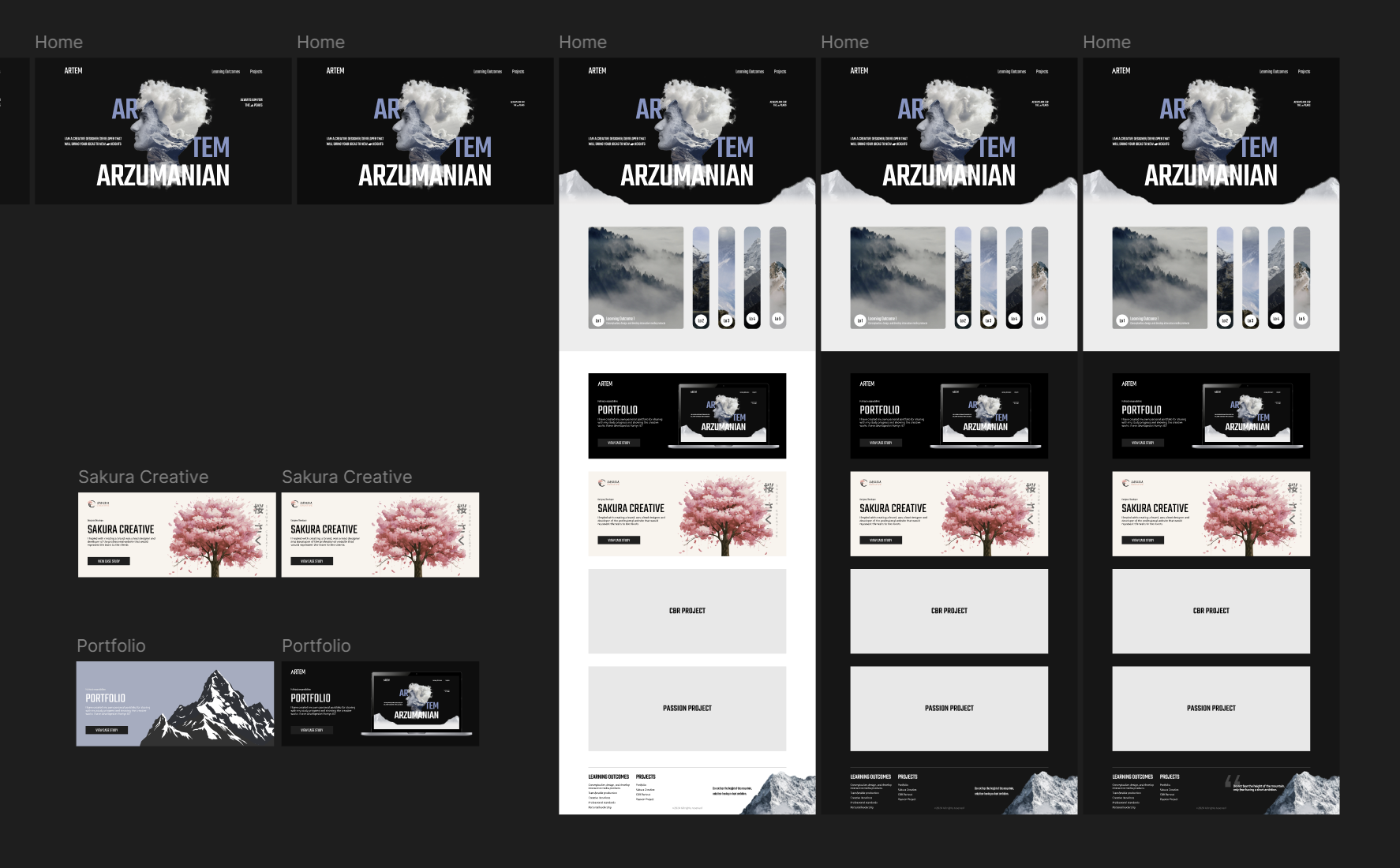
After completing the final wireframe and getting positive feedback on it, I started creating draft designs of the home page.
I had an idea to implement parallax scroll, so that there would be a mountain part on the hero section that would go up and appear to be a part of the learning outcomes section. I spent hours searching for the right images, removing their background and cutting them, changing positions, adding in the gradients, but nothing worked. I had no idea how to implement my face on the hero section and couldn’t find proper inspiration from other websites either. I kept going, I tried dark mountains, I tried greenish ones, at some point even tried to implement caves, nothing worked, until I tried to oversimplify. I removed the mountains, desaturated the image, removed all the distractions and added in my initials. Suddenly, it worked, so I started building on from that idea. I added in the color, made my name parts blue so its clear that it is a one word. I kept tweaking the positioning of the text, added in the clouds to cover the bottom of the image shape. and added in the white mountains that slowly turn into a white shape for the learning outcomes. Lastly I created two stunning project cards.
This was a very tough challenge to design that without any inspirational support from other websites and I grew a lot as a designer during this process.
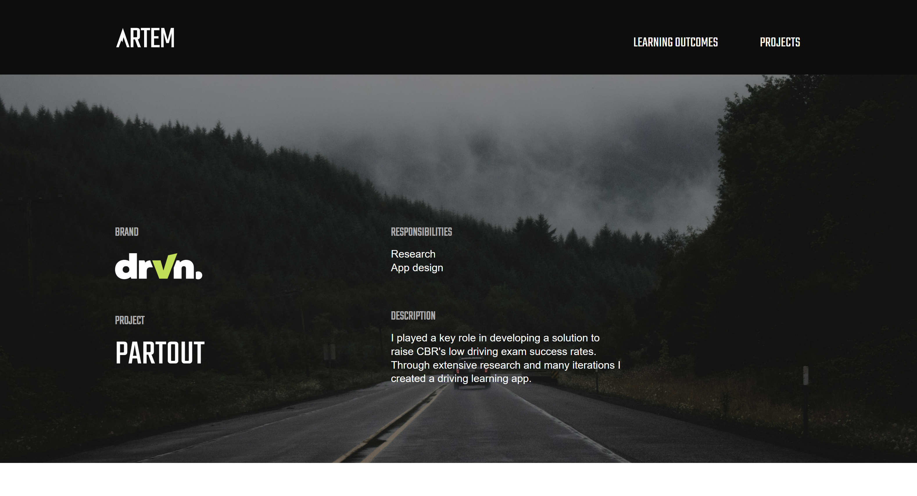
After being done with the research I needed to create a sitemap for the driving learning app to show it to a client when validating our ideas.
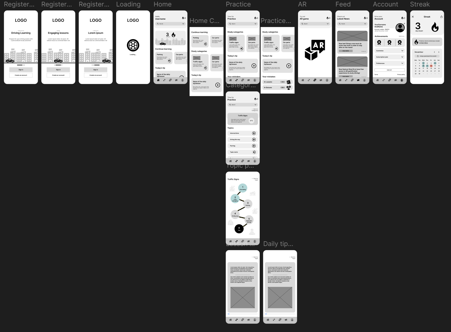
I have discussed with the team what features and elements needed to be included in the app and wrote down a list of these sections to have a clear overview of them. I then started combining them into categories and putting them in the flowchart that seemed logical. It is pretty hard to notice some errors in the sitemap when sharing it with the team, so I went on to create a low-fidelity prototype of it to see the pages and the content they will have. I got feedback on it from my teammates and made a few iterations: I added a loading page to be a preview page before you land on the home page; I made the top-bar text to state the page you are on instead of having hello user everywhere; I removed the XP points because we decided not to have this metrics system in the app; Finally I added a lesson page to showcase the structure and the look of the lesson card and text.
With all this new iterations the wireframe already looked good enough to start testing its usability with users to find if the structure and the sitemap are on point.
My team and I have done the wireframe tests with different people(see in lo1) and I got the key takeaways for iterating the structure.
I took the old wireframe and went one by one over the list of things that needed to be moved elsewhere or added to a page. I iterated the sitemap heavily, improving the flow and logic of the pages and subpages. On the home page I put in the “Continue learning” section to jump back into the lesson topics you were last doing; I moved the daily tip to the home page because users felt like it was a more logical place for it to be; I iterated the navbars icons, now there was a Home page, Exercise page, AR, Feed and Account pages. The streak got moved up because it was no longer a page anymore. Now it is a pop-up that appears on click and closes. The practice page now had a section for mistakes so you can redo the quizzes you failed at before. After creating all that I got more feedback from Pennie and iterated the pages even more: I put back the progress dashboard on the home page because even though I have the streaks on the top right corner it is still valuable information that user needs to see on the home page when the opens the app, repeating information can be a great tool when used carefully; I also added in the initial 3 pages of the app, before you even login. It will help with giving an introduction to the app and its features.
As a result I have done many iterations based on, feedback and testing results, which allowed me to create a finalized low-fidelity prototype of the app.
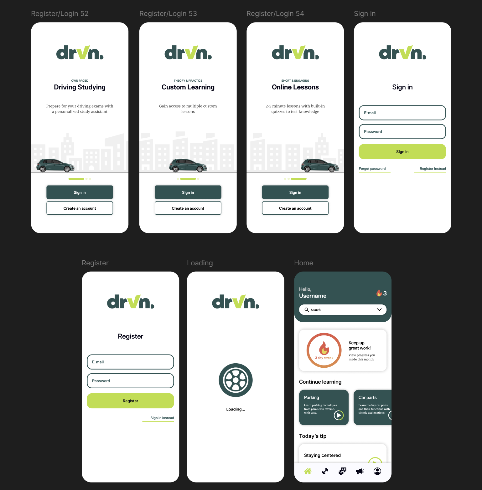
The time was ticking and I had to finalize the design to be able to prepare for the final presentation, so after receiving the colors ant fonts from my teammates I started to full in the content.
I set up the logo on the preview pages, added in the text and colored the buttons. I decided to color the navigation bar only on the app pages because if I did it with a top bar as well the color would overwhelm the content inside the pages. I added in the image and the icons, made the streak page and added in all the needed text. The design looked decent, but that wasn’t something I set to achieve. It felt like the colors don’t fit the message. Soft blue with red looked too childish or sports car like which clearly didn’t fit the tone of voice the brand should have and after sharing with my concern with the team, we took a decision to change colors completely. A few of my teammates have finalized them so I recolored the entire wireframe whilst also making the top bar green. With this green, white, grey and salad green contrast the overall look boosted twice as much, while being easy to read through and engage with. I additionally added in the sign in/login pages to match the system with the dashboard my teammate was creating for instructors view, thus providing consistency across platforms.
The overall design looks very clean and professional and I am happy that my teammates trusted me with working and iterating on it.
My portfolio consists of projects and learning outcomes. I have integrated a similar to the last semester structure of the learning outcomes, but with the project pages I wanted to design them from scratch. Sakura Creative project was chronologically the first project that I finished fully, so I started designing that project page first.
I drew inspiration from different creative designers from the Awwwards platform, finding different ways to present my projects while not making it boring. That helped at first a lot so I didn’t have to come up with something completely new. The difference between my portfolio and others is that in mine I actually need to talk about an every single phase of the project and show as much content as I can to make sure teachers see my progress and work. That is why I have found a simple design solution to fit my case. The projects pages would consist a cover page that would have a description of the project and my roles within it. Then there would be a challenge(problem) statement. The rest of the page would consist of different phases(Research, Design, Development) that would have sub-tasks with a little text and lots of images. This way I make the page very interesting and in the style of the project I make. Finally I have a section showcasing final product and a reflection with a quote about the project. I created a simple yet effective structure that I easily filled in with content and have designed all the project pages.
The main iterations across the pages are the sections complexity. With the Sakura creative page I was sometimes using more complicated layouts, putting images to the sides, which made it more of a hassle to code. Keeping that in mind I made sure to design the rest of the projects aligned to my set layouts.
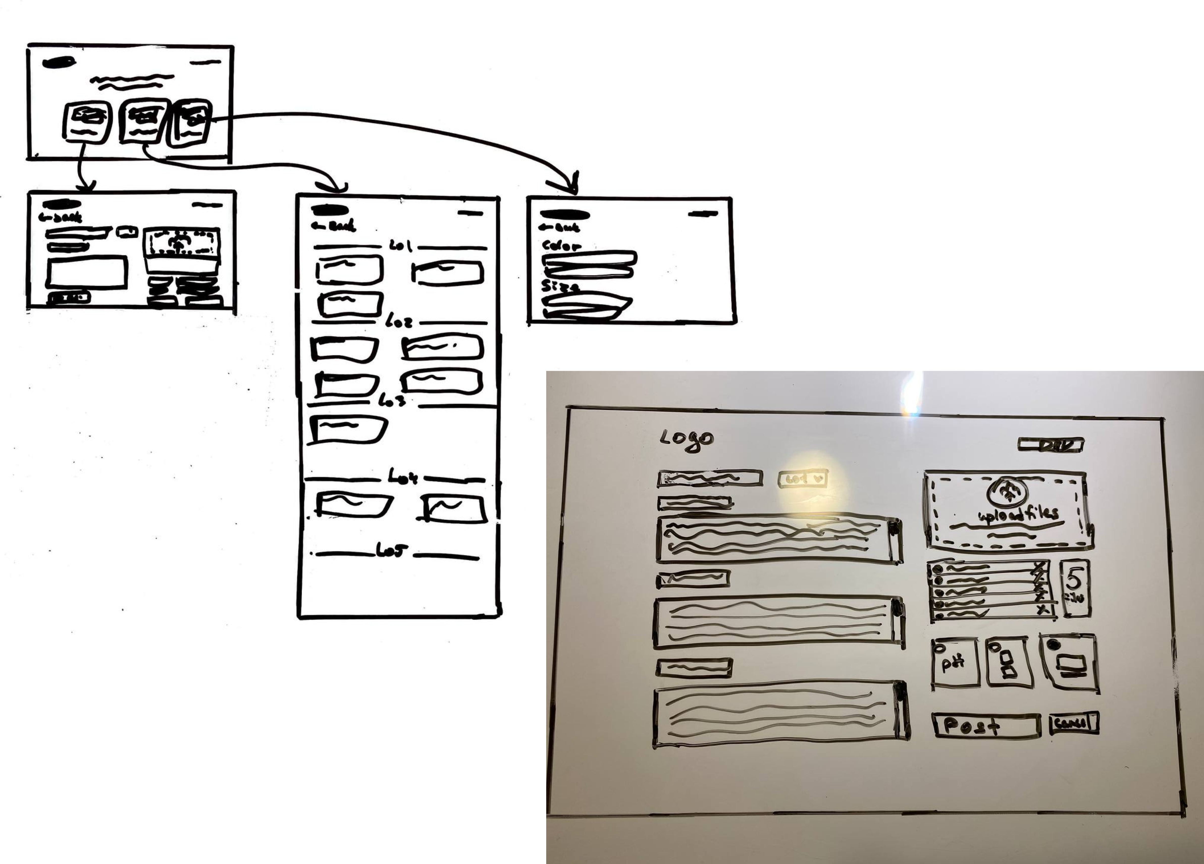
I had to design the tool I was creating for the passion project of mine. I had only a few days for the designing process so I had to create a quality product in short period of time.
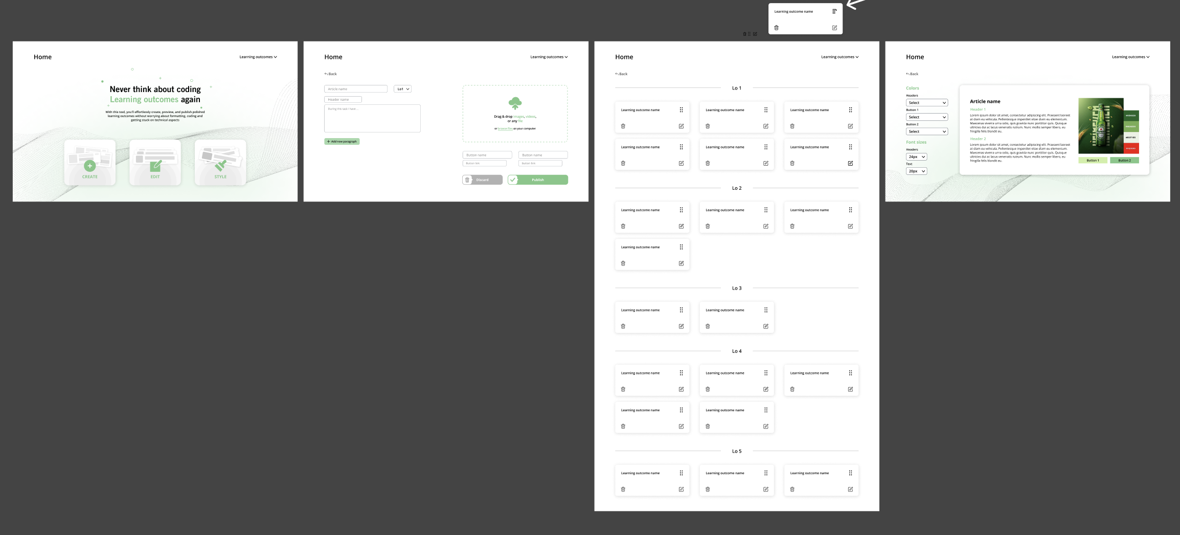
I already knew how the tool would look like since at the beginning of this semester I started exploring this content management system. I have already had many different sketches from the last time, now it was time to iterate on it a bit and finalize the sketch. The new structure of the create page would now have only one slot for a header and text open instead of three. There would be a button to add a new paragraph which would add more space for new text if needed. This way I save space and make it easier for users understand that they are in control of the article structure. I the previous sketch there were three buttons for a user to choose whether he wants to show the PDF, image carousel or a video. I realized that there is no need to give out those options, instead I can just communicate that any file works and then the system would automatically define if the file format if MOV, PDF or whatever, and will create the needed semantic tags for them. That’s what I did later while coding, the system checked if there was more than a single image, a carousel would appear that would fit the needed amount of imagery.
What’s new is that I sketched two new pages, one that would give you access to editing the existing outcomes, and the other to choose the style of the text.
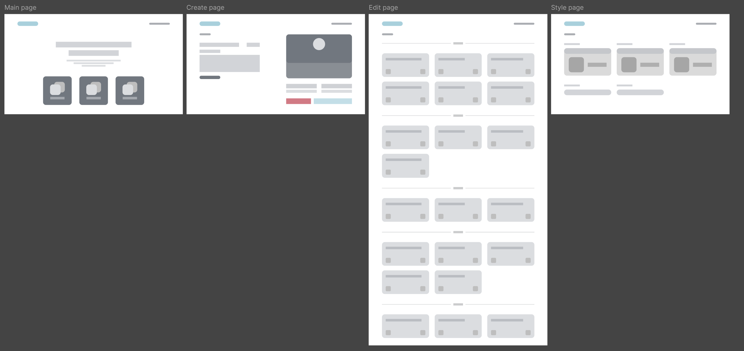
After finalizing the sketch I went on to create wireframes and further on finalize the design of the tool.
I gathered the inspiration and put it besides the design section so I can always check out the standards and trends among similar designs. I developed the wireframes and being satisfied with their look, started filling in the design. I have created custom buttons that would lead to the needed pages and have finalized the style of the first page. I experimented a bit with the cards on the edit page. I asked a few people for what the button to move the outcome would be and have decided to use a pair of three vertical lines. Later when coding I recognized that in my system you don’t drag and drop the cards, you just click on the icon and then choose which outcome it should move to, so to avoid user confusion, I iterated the move button to look loke something you should click on rather than drag. The style page looked pretty empty and i did not what to do with it. I got feedback from Dirk and with his suggestions, I have iterated some parts of the pages to be more consistent, and added a live preview section to the style page, to see the changes live while you edit the style.
Looking back to it, I feel like for the short period of time that I had, the product was looking slick and clean.
.png)