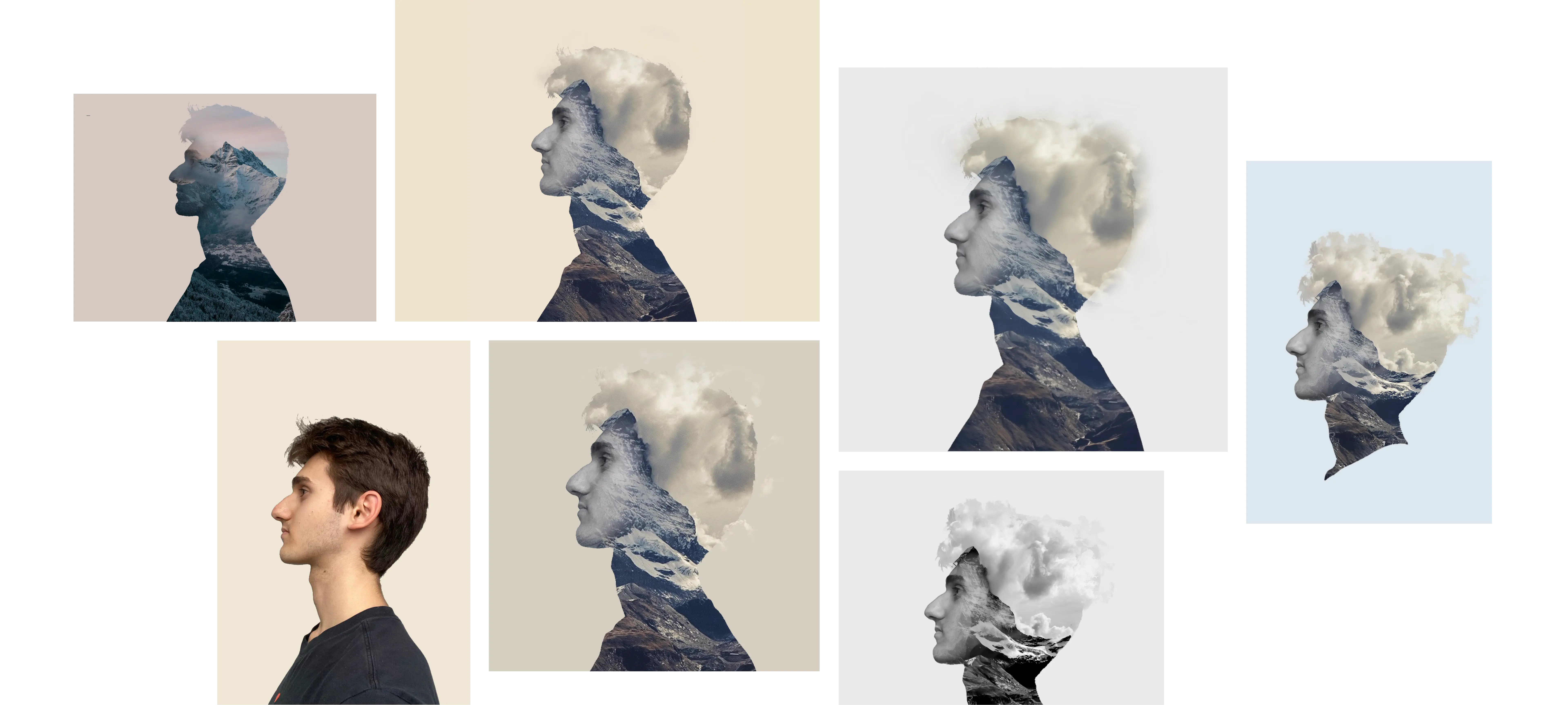
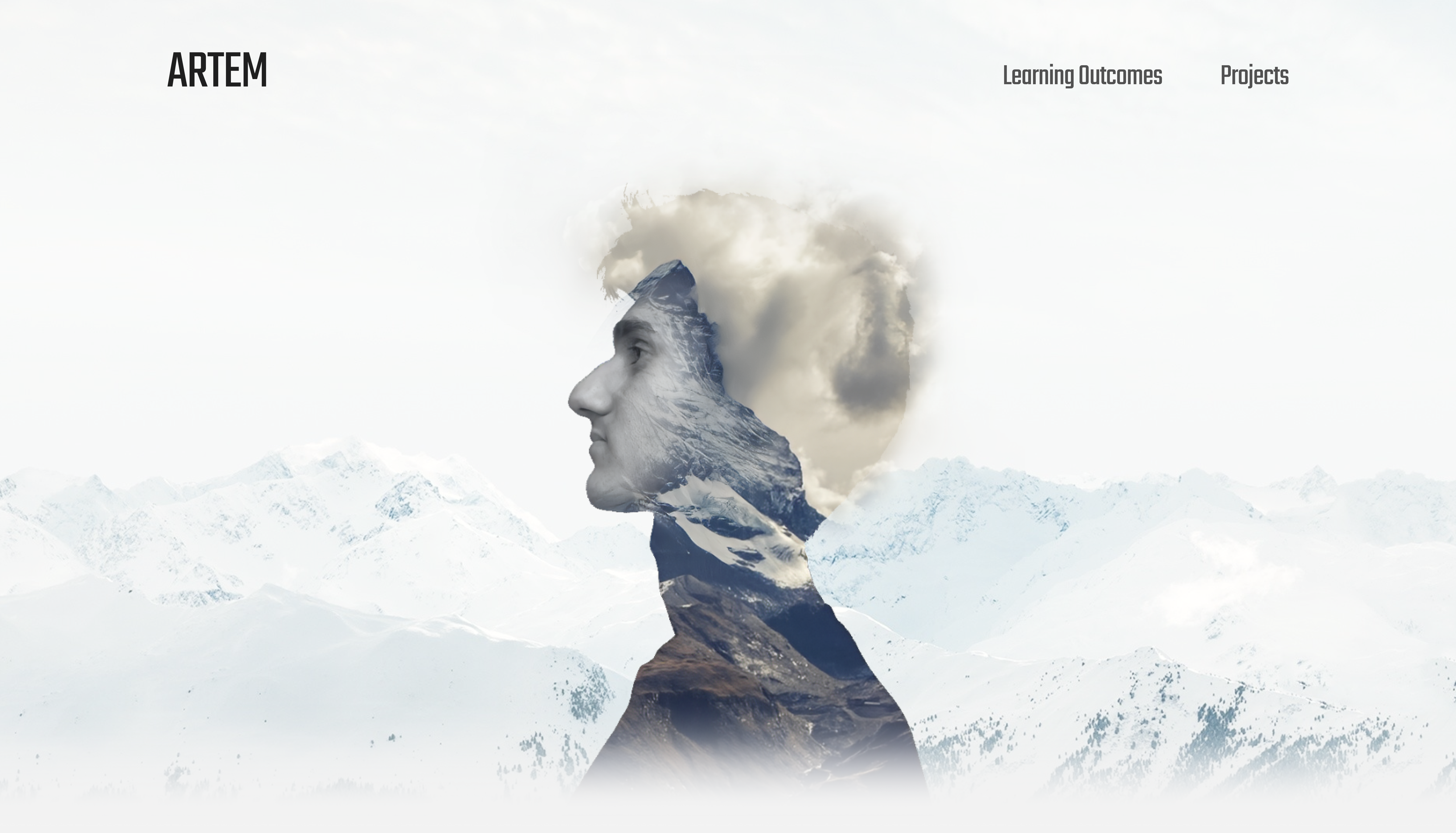
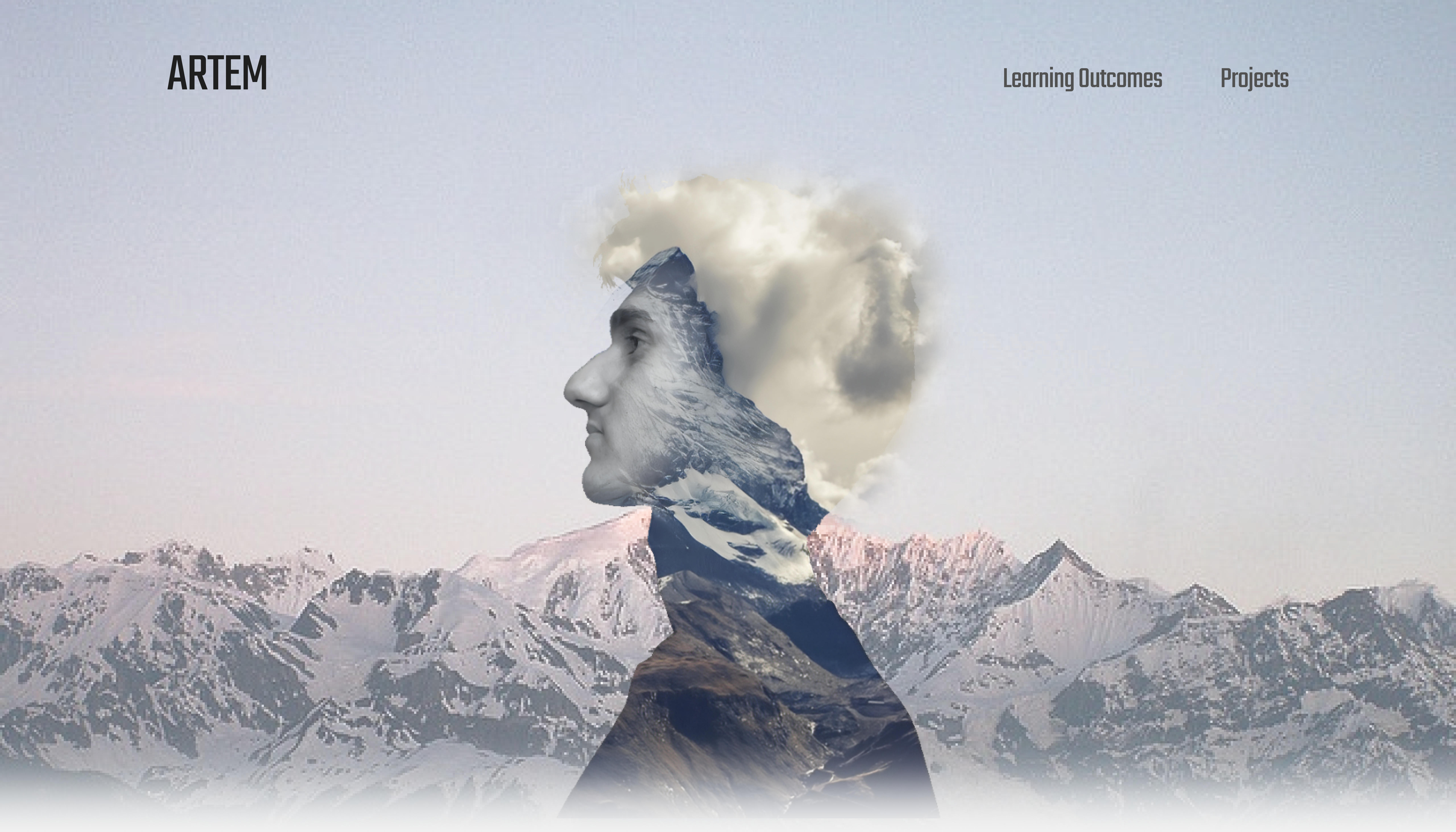
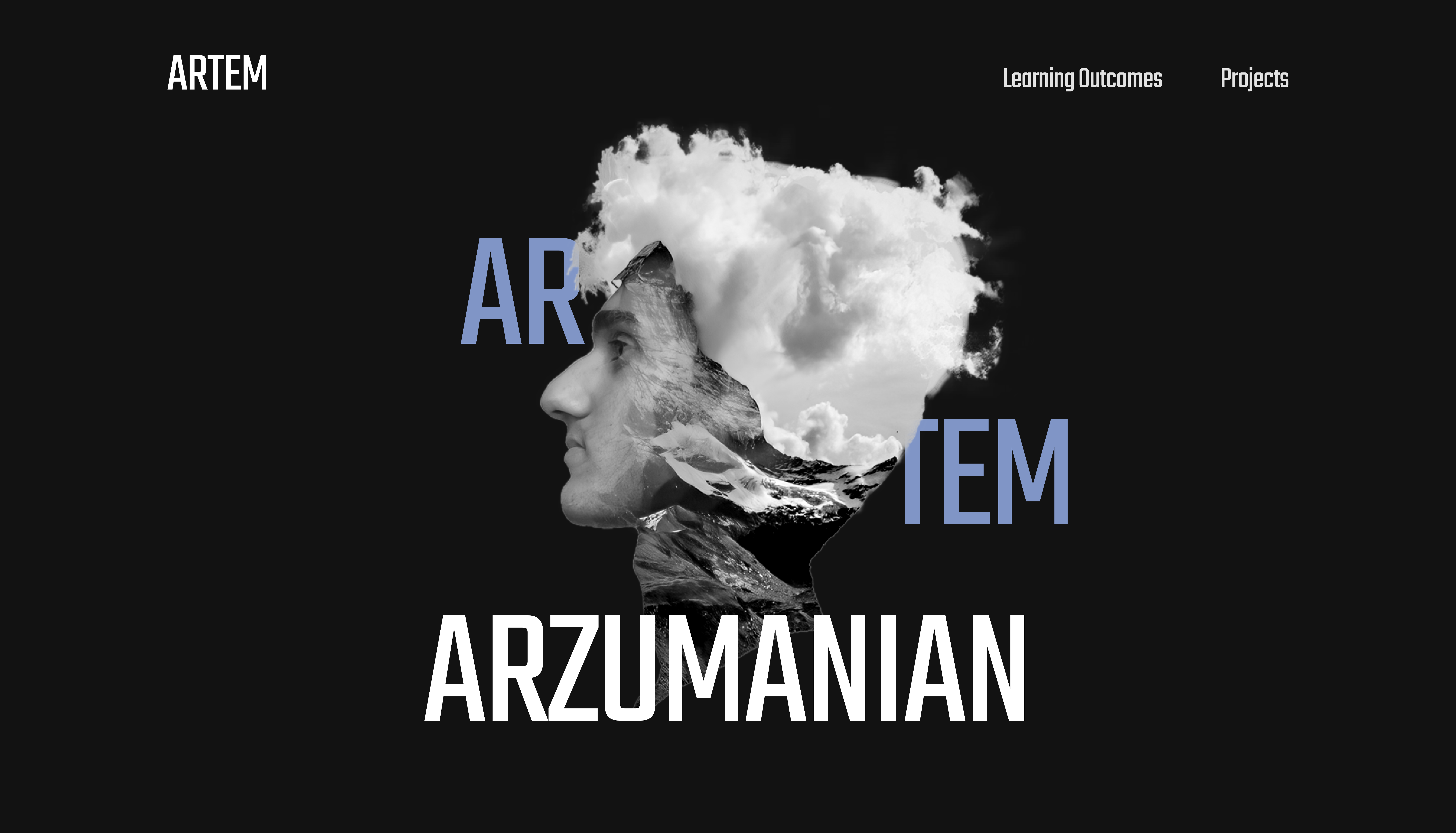
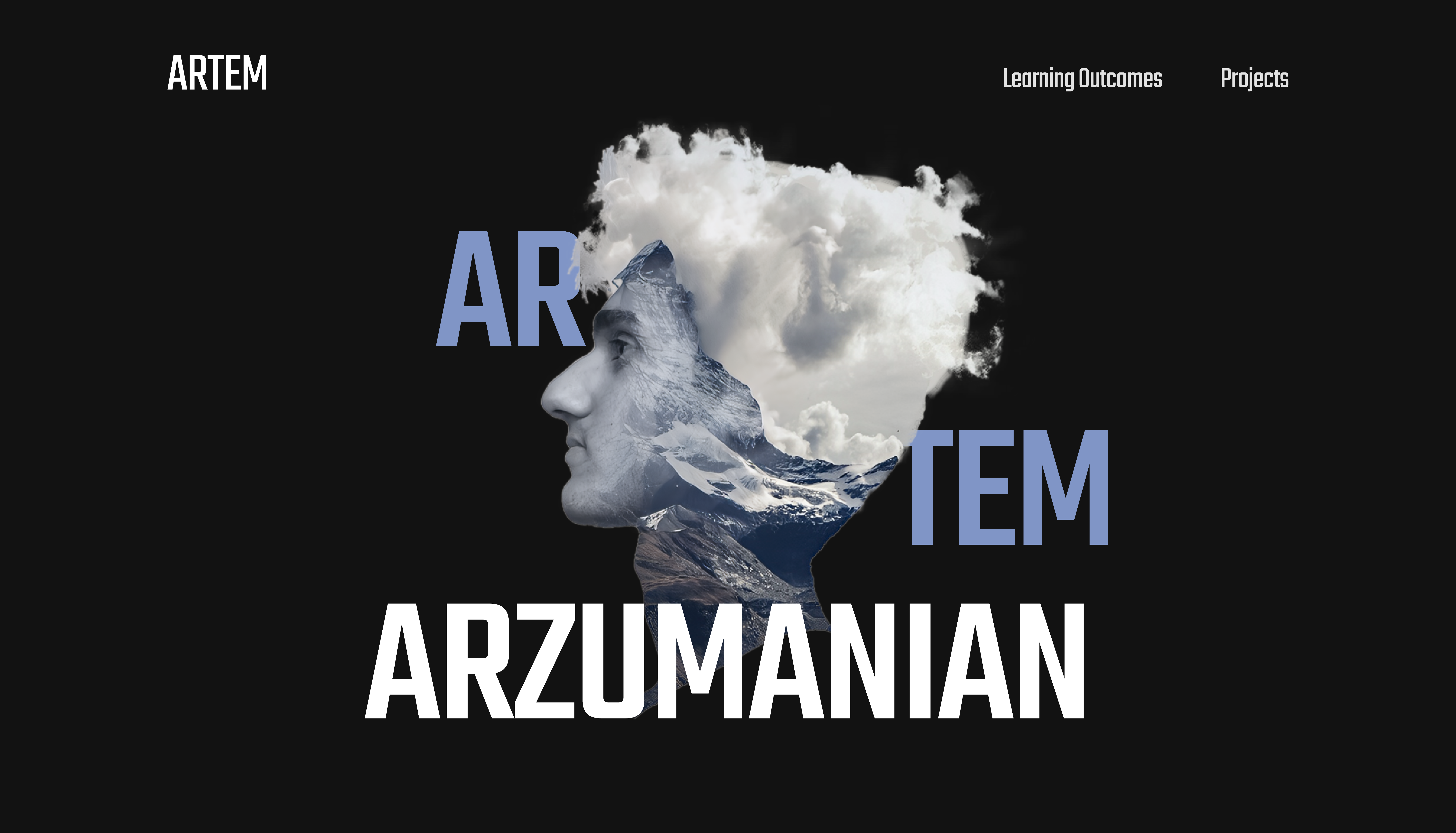
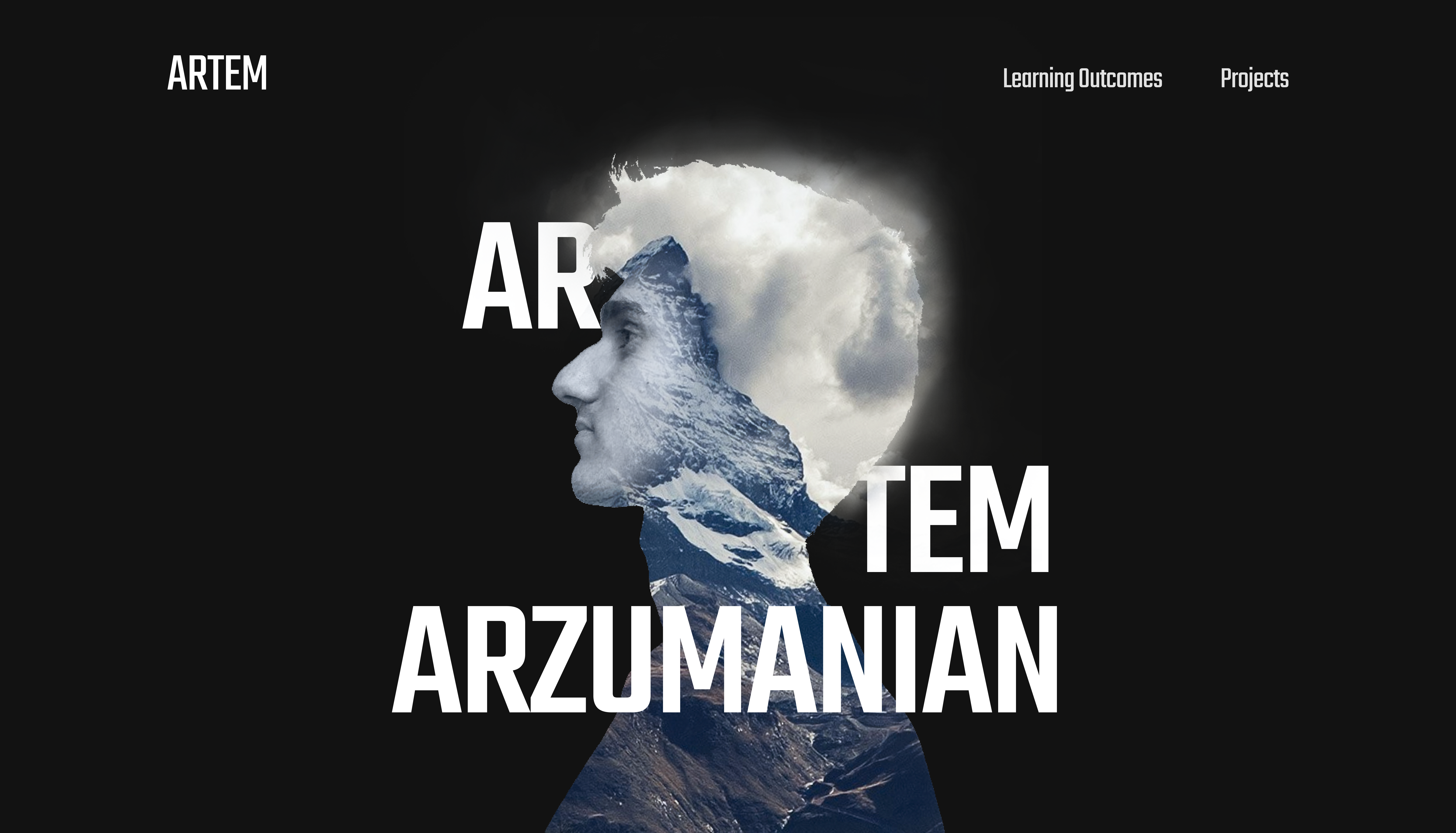
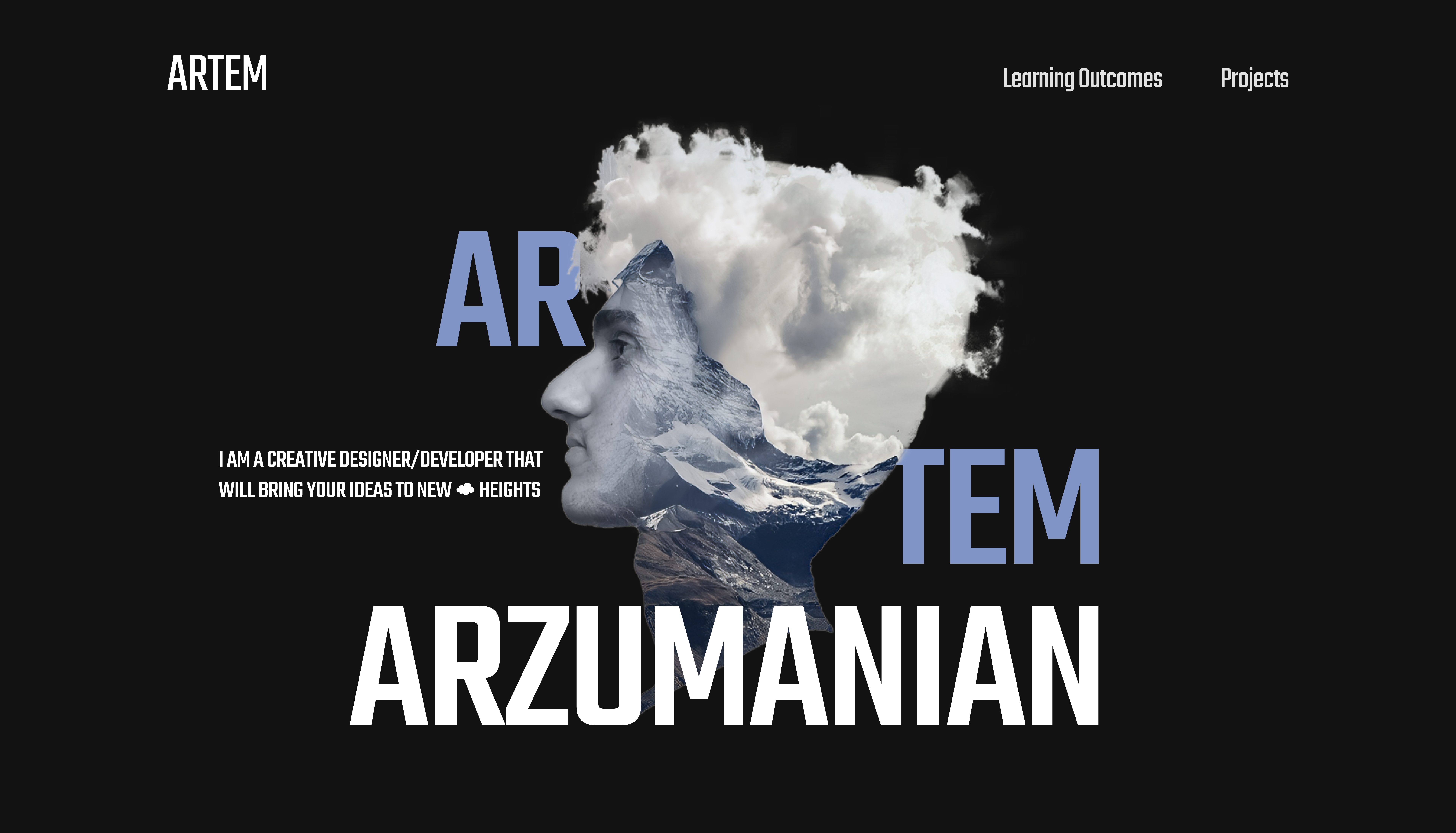
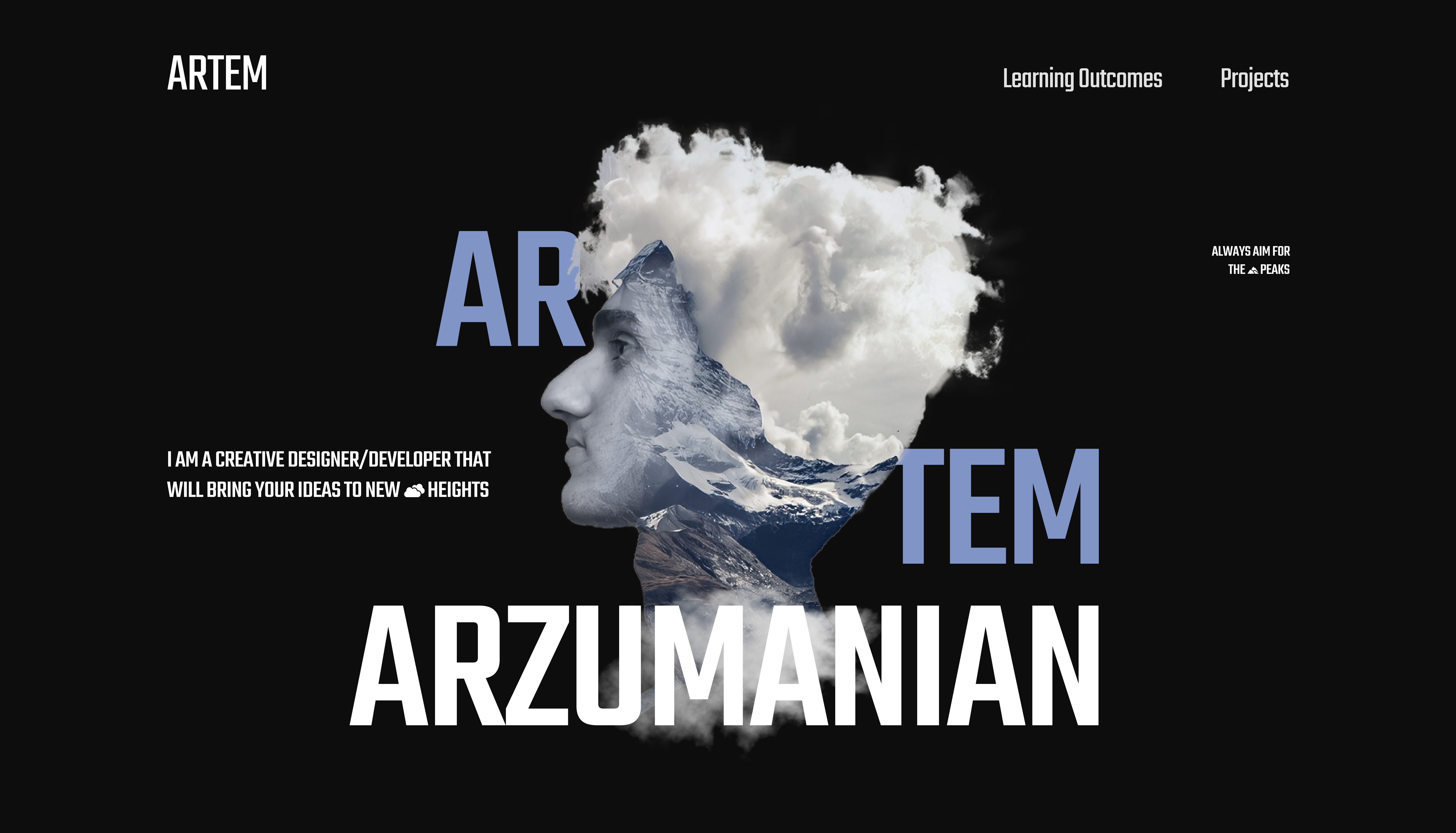
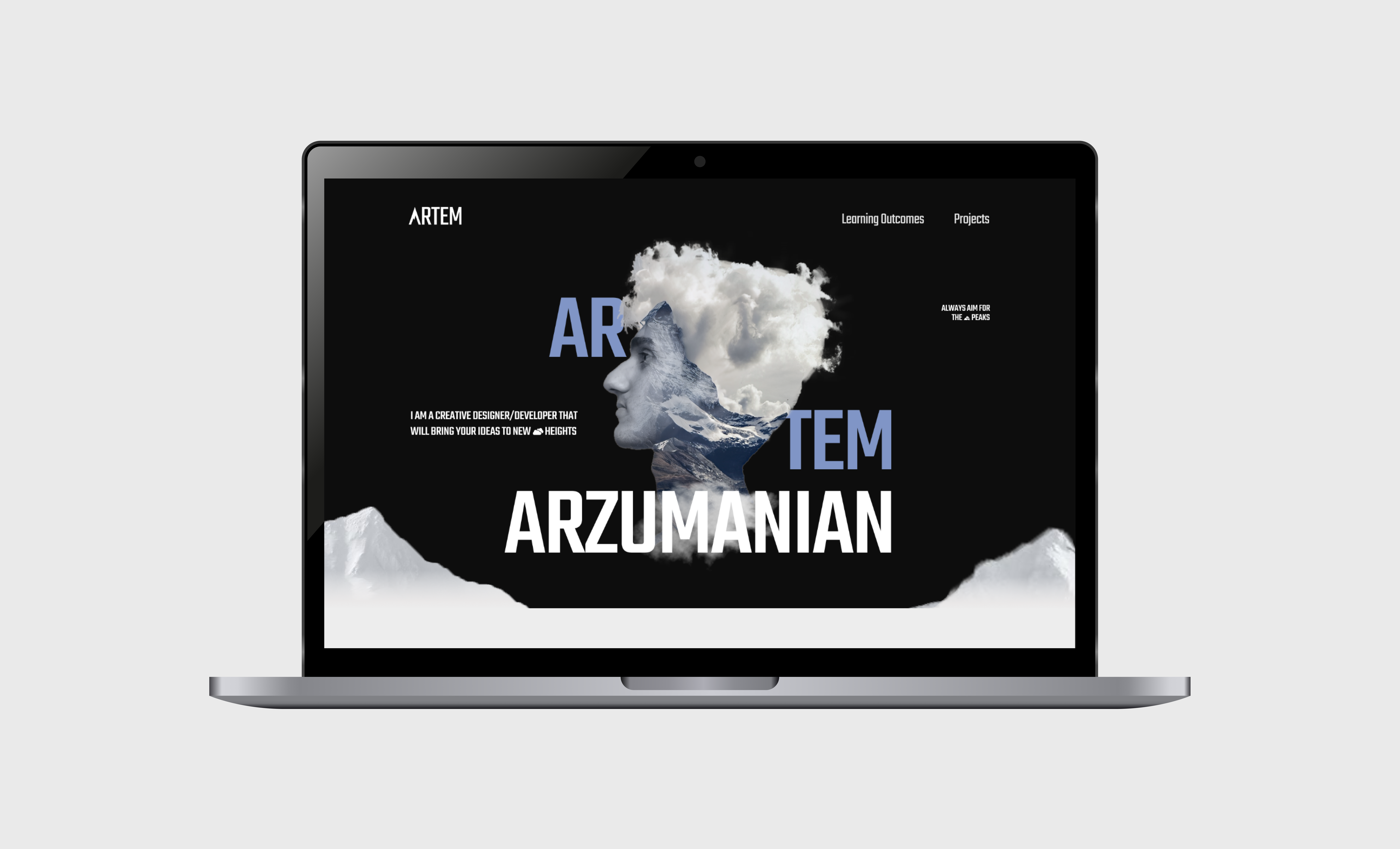
Project Cover

BRAND

PROJECT

PORTFOLIO

RESPONSIBILITIES

Full stack
Web Design
Development

DESCRIPTION

I have created my own professional portfolio for sharing with my study progress and showing the creative works I have developed at Fontys ICT

THE CHALLENGE

During the 3rd semester at Fontys ICT I took on a task of creating a personal portfolio. The portfolio's objective is to provide insight into my learning process and demonstrate the progress and the work I have made. It should have my own style, structure and layout and would directly contribute to me passing the semester in this study.

Sakura Picture
RESEARCH

DEFINING THE SCOPE

Before kicking off the project it was important to define it’s scope. I kicked off the process by deciding on things that need to be done during this project, setting clear expectations and deciding on the style I want to pursue this semester. I choose nature/mountains for the main style of the website and have created a briefing document in which I stated the design, style and layout choices.

Sakura Team

SETTING THE VISUALS

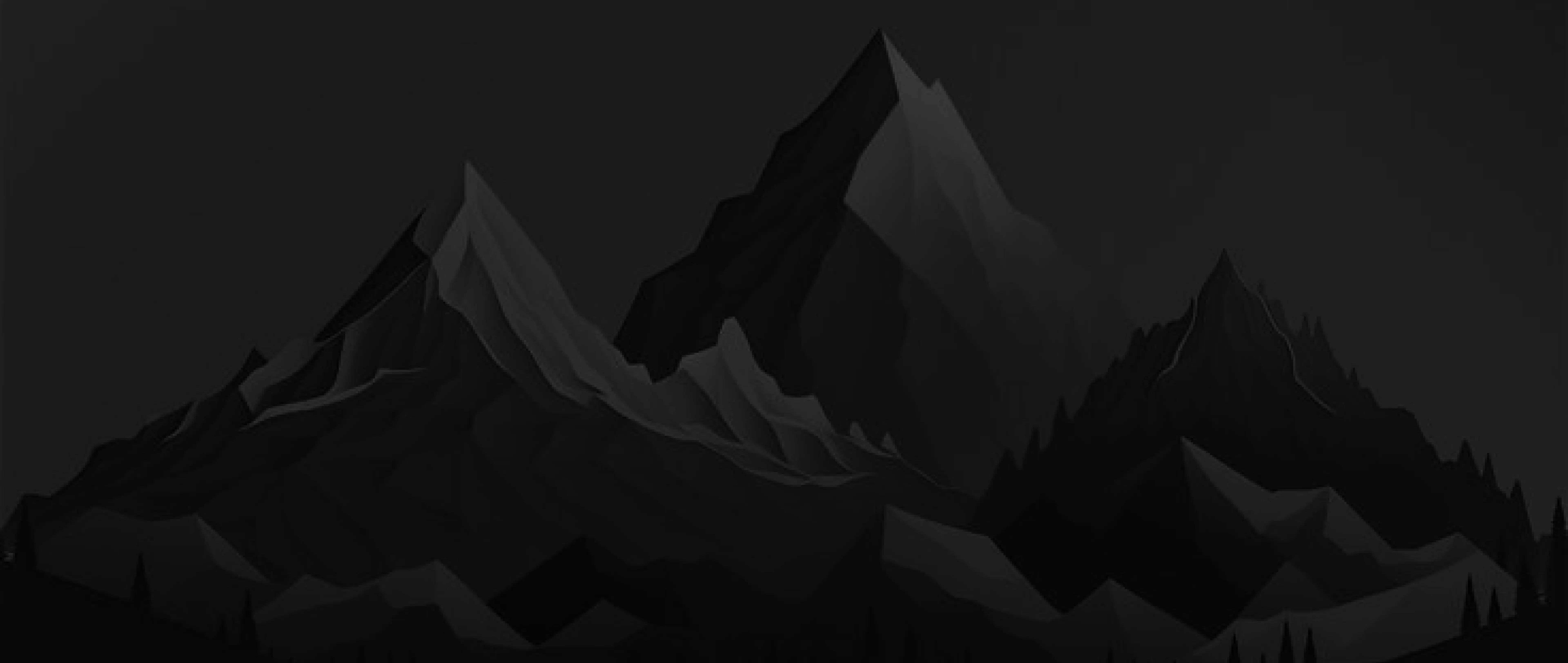
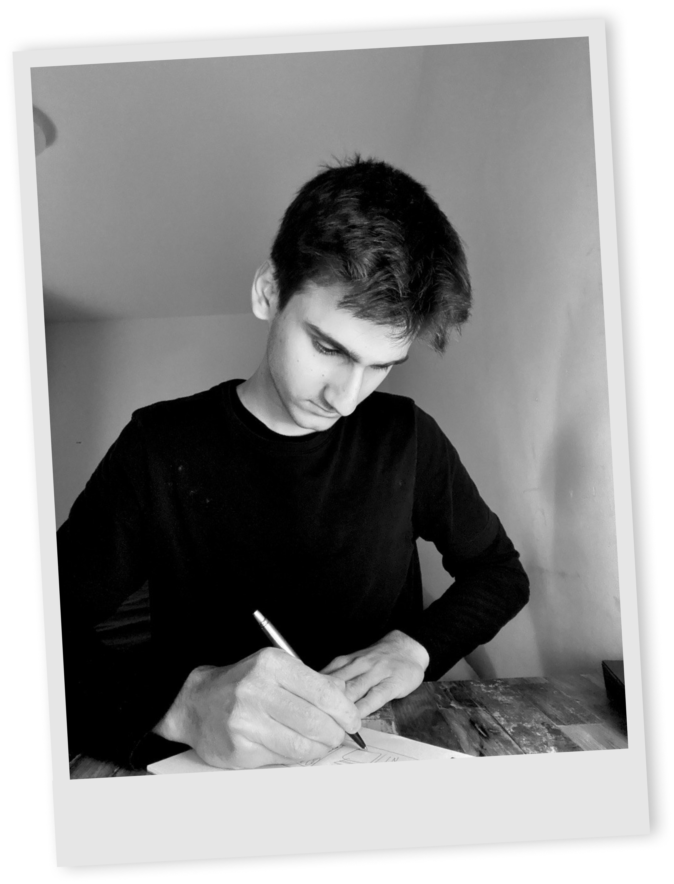
I gathered bunch of different photos for reference in my own design process. An interesting element I have never tried before in my designs was double exposure, so I wanted to incorporate it in my work. Another thing I haven’t explored yet was using a picture of me in the hero page, so the challenge was set. I looked into true detective artwork, Armenian styles and different double exposure posters to create the moodboard.

Sakura Team

FINALIZING IDEATION

To sum up the research and the main style choices I have created a style board with the images, colors and fonts that would be the main guidelines in creating my portfolio. I decided to go with a soft blue as the most heavily used color and a supportive orange color for different accent points and button hover. The font Teko looks tall and strong just like a mountain and Vazirmatn body text complements its style while being easy to read in bulk.

Sakura Team
RESEARCH

MAPPING THE USER EXPERIENCE

Last step before approaching design phase was sitemap creating. To set the flow of my portfolio I had to think like a user, which in my case were teachers.
The user would end up on the Landing/Home page which would link to Projects and Learning outcomes pages.
Each project page would be a visually engaging walkthrough of the project I have been a part of and would describe shortly the tasks I have done.
The learning outcomes pages would include all the tasks I have done at Fontys and ICT field. All these pages would have a card recommending to see the next thing, to keep the user on the site.

Main differences between project and outcome pages are the ways I document content, the projects pages would have lots of visuals and little text and outcomes pages would have all the tasks with, documentations, file linking and feedpulse iterations

Sakura Team

TAKING FIRST STEPS

By the start of study week 4 I have already sketched some of the home page ideas out. I went with center based design that would have a face as the focus point and text around it. The next thing would be a learning outcomes section that could be presented as cards. Under that part the projects would have their own cards with a topic name, description and a linking button. I played with different variations of same pages to try out new combinations.

Sakura Team
DESIGN

FRAMING THE LAYOUT

I combined the finalized ideas in a wireframe to see a higher fidelity version of the portfolio. Playing with size, shapes, content management was an interesting exercise to perform. I lined most of my ideas to the design and had a solid foundation to iterate the wireframe.

Sakura Team

BECOMING THE PROTAGONIST OF MY ART

Instead of having a regular portrait image of myself on the hero page I decided to go big and show my creativity and skills the moment a user land on the page. I took a side profile image of myself and using Photoshop combined the face with the mountain. In a process I realized that the mountain shape reminds of the hairline shape and tried positioning it to follow the face structure. The clouds were also a cool touch I discovered in a process. Clouds look like messy hair and I used that to replicate it without showing any actual hair.

Sakura Team
DESIGN

DESIGN EXPLORATIONS

I tried out filling in the content of different parts of the portfolio. It was a fun process that gave impressive results. The learning outcomes cards contain a number in the circle even when the card is collapsed to always have a clear indication of the page’s content. When opened it would display the text description of the outcome itself. The project cards additionally display a logo at the top now, to connect it to a project theme even more. At the footer I added a quote over the mountain which turned out to be a cherry on top.

Sakura Team
DESIGN

HERO SECTION REFINING

The biggest struggle of all was the hero section of the portfolio. I had no idea how to incorporate the mount face I created earlier and combine it well with other content. I wanted to make it so when I scroll down the page, the element from the hero section combines with a learning outcomes section, thus creating a smooth transition. As a n example I tried to have some mount parts peeking from the bottom and then morphing into a shape that contained the outcomes.

The key to finding my way out of this difficult task was to oversimplify the design. I removed the background images, got rid of unnecessary text and colors and suddenly something sparked in me and I have iterated the hero section to a desirable outcome

Slide 1
Slide 2
Slide 3
Slide 4
Slide 5
Slide 6
Slide 7
Slide 8
Slide 9
Slide 10

PROJECT PAGES DESIGNING

When creating project pages I focus on telling the story and making it fast to scroll through and yet interesting to look at. I wrote down the phases that need to be talked about in the project as well as what products to show and how to call the articles. The structure is simple yet effective during the coding phase, as I am just always reusing the same section structure of text and image under it. Every project description would have its unique style and content, but they would have consistent sections such as: a cover page, challenge description, final product showcase and reflection.

Sakura Team
DESIGN

ATTENTION TO DETAILS

Late in the project I got feedback on small parts of the website that I could iterate or change fully. I added covers to the learning outcomes pages to match with the project pages’ covers, thus improving the consistency of what user expects on the pages. I also added the “See next Outcome/Project” cards that would keep the user on the website for longer, because they would mindlessly click on the last call to action on the site.

Sakura Team

COMBINING ALL THE DESIGNS

I combined all the designs together to see the full picture. It was important that all the pages are consistent, easy to understand and scroll through and have high quality content to prove my study progress to the teachers. I validated the designs and was ready to set my foot on the development phase of the project.

Sakura Team

CREATING THE WEBSITE

The second portfolio review was approaching, so I took action of coding the website right away. Using GIT environment, I brought all the wild ideas I had to life. I made a decision to not make the website responsive for phones as my target audience are laptop users that need to see lots of images and read through lots of text, however the website ran smooth and functioned well across all laptop devices.

MEASURING SUCCESS

"Creating a personal portfolio isn’t an easy task, you need to possess not only technical and soft skills, you must also be persistent enough with yourself, your choices and your big idea. Working on this project helped me grow and learn to push through the tough challanges."

What went well

I think I did well at planning out my tasks. I was mostly on schedule and always knew what the next part of the creational process was. I had clear expectations and vision for where I wanted to be with this project and in a sense it helped me with my confidence in the work I did. I was trying something completely new this project, new style, dark mode website, lots of photoshop usage and a bold structure choice of the project documentations. I am proud that it all worked out well and I managed to perform on a high level.

What would I do differently

I believe that this project didn't have too many errors. The ones I am aware of and manage to recall are feedback receiving. I think I could have done better at approaching different teachers asking for feedback on different design, style, layout choices. That could have doubled my workload because of the iterations the site would have to go through, but the result would have increased relatively. Nevertheless this way I also experienced what it's like to work alone with little support and get through difficulties without external help.

SEE NEXT PROJECT